Sunday, December 27, 2009

The Glove Compartment: An Education


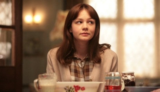
The key object in An Education, a peculiar but stifled new English film based on a memoir by Lynn Barber with a screenplay by Nick Hornby, is a glove compartment. The glove compartment is in the car belonging to David (Peter Sarsgaard), which itself may have been stolen, considering that he is a professional thief. He has seduced—or almost seduced—a sixteen year old girl named Jenny (newcomer Carey Mulligan). It is London in 1961. Jenny is a schoolgirl at a London prep school where she plays the cello and dreams of getting in to Oxford. Her schoolteacher (Olivia Williams) has warned her about the difficulty of being accepted in to such a prestigious university, and Jenny’s parents (Alfred Molina and Cara Seymour) mainly seem to care about whether or not it will whisk Jenny away to a respectable future—and whether or not they can afford it. When Jenny meets David, she finds an affluent man who, if almost twice her age, will take her to Paris, to Oxford to meet C.S Lewis, and will buy her whatever she wants. Even when she finds out how he makes his money— by stealing various collectibles and selling them, and by renting out illegally acquired property—she decides to turn the other cheek. But there is always the question of the glove compartment; first, Jenny finds cigarettes inside, and promptly takes up smoking. And there are other prompts inside.

An Education is, in the most intentional way possible, a British School Film. Its place must therefore lie, quite awkwardly, amongst past British School Art. Generally, the Brits don’t like school too much. As early as Roald Dahl’s story “Galloping Foxley”, the horrors of boarding school were disclosed in great detail. Lindsay Anderson declared that the headmasters should be shot down in student revolt in If… Pink Floyd made an ensemble of children tell us that they didn’t need no education. The Harry Potter series, most recently, have been books based on the childlike conceit that school, or even all childhood, should just be like that. An Education stands as the conservative counterpart to all that noise. It’s message is that one should get educated; not just in life, but in the traditional sense, doing homework, applying oneself, getting in to good universities. This is a good way to spend your youth. And no, it won’t turn you in to a total bore.

No viewer is going to believe that Jenny—this spunkily pretty, intelligent girl—is going to become a bore. If anything, it is the one’s who have not gotten any education who are ignorant bores; David’s friends and partners in crime, Danny (Dominic Cooper) and Helen (Rosamund Pike), for instance. But the film’s parental stance might be easier to take if it didn’t also lack a certain degree of horror and confusion that artists such as Anderson and Dahl knew should be present in stories involving growing up and mistakes. The central situation in An Education is one of sheer perversity. Here is a con-man (and we, the audience, know it from the start), who romantically desires a much younger girl, and society is not just okay with this, it is enabling it. All Jenny’s parents want their daughter to do is to find someone else to take care of her. Her friends don’t think it’s remotely strange that she loves an older man, they think it’s terrific. Her headmistress appears to take the position that Jenny is just a foolish girl, and a lost cause. The film doesn’t take these attitudes as perverse and confused, it looks at them as charming misconceptions of a bygone era. It makes them beside the point with Jenny’s ridiculous affectations and the question of her virginity. Only Jenny’s teacher tries to let her know what she is getting herself in to. But once she helps Jenny come to her senses, we are faced with an unrealistic solution to the horror and confusion that were never there; maturity can come about through studying and achievement and reconciliation can make all ends meet.

It seems that if there were any film that should question societal morality, even if of a specific time period, An Education is it. But director Lone Scherfig stifles any serious questioning, preferring to tell a story about a cute, wayward girl, who makes a mistake, gets out of it, and makes some societal observations along the way. Carey Mulligan has created an odd and believable character, as has Sarsgaard, yet the direction did not do them justice. Scherfig has a talent of crafting pure situations; he knows that the glove compartment is pivotal and that what’s inside has to be key. He doesn’t know what to make of the world outside of the car.

Friday, December 18, 2009

Motion Studies: The Action Image


It is heartlessly impossible to describe and analyze almost any image from Fritz Lang’s Spies. This is because they are clever pieces of bait that scream to be appreciated rather than explained. Unlike most action films made today—and Spies is a sincere, modern Mission: Impossible before there was a hokey, post-modern Mission: Impossible—we take the bait and love it.

That bait includes such images of a female hand holding a cigarette, while the other gently swings a gun in to the frame, a sinister icon-shot of one of the masterminds who keeps the main characters in his clutches, a Japanese diplomat committing slow Hari-Kiri, and an oncoming train barreling in to another train in a tunnel. All of it’s images are action images. They are obsessed with motion in it’s fastest, most sensational and outrageous forms, and they pursue all the details that are possible within these forms to build on the story. One of the more decorated of these images is an overhead shot of a boxing match that takes place in the ballroom a ritzy restaurant. An orchestra is accompanying the match. The area is lit with only two overheads, so that the flailing shadows of the boxers can be seen on the upper and lower sides of the ring. Shadows were an epitome of German Expressionism—a movement that was shriveling away by 1928 in the purest sense—but Lang made sure to reconcile it’s conventions with this quite new genre; the espionage thriller. This boxing image holds on to these expressionist notes for about ten seconds (and for several other quick, inserted shots), before pulling the rug out from under our eyes. A boxer is knocked over and he stays down for more than five seconds. The orchestra raises their violin bows and light floods the ballroom in a second. The bourgeois audience who has been sitting at their tables in a circle around the ring, in the dark, leap to their feet and crowd the ballroom, dancing waltzes around the boxing ring to the orchestra’s inevitable change of music. Then the camera has nothing else to do move in to the heat of the party and focus in on two pivotal characters, one of them a spy.

Cinematographer Fritz Arno Wagner probably sensed these shots were a suspension of the story per se, but he probably didn’t care. It gave him a chance to light a scene more dramatically than anything else in the film. Lang must have known the boxing interlude, and the shift to the bright light and dancing was not a pivotal moment to the forward momentum of the story in and of itself, but he chose this moment—simply a weird introduction—in to a grand showmanship moment, where the audience would feel yet another thrill go down their spine. This is probably the essence of the action image: thrills at all times, and at all costs. As long as these thrills are playful, as long as the details are strange and unexpected, each thrill can do the last one one better.

Saturday, December 5, 2009

Fantastic Mr. Fox


Wes Anderson, in his ongoing quest for the perfect image, has recently ditched live-action, for the time being, and turned to Stop-Motion. In a way, this seems like his natural calling; here is a way, finally, to arrange everything so perfectly that not only are accidents not acceptable, they do not even figure in to the vocabulary of a stop-motion image. The whole point of stop-motion animation is calculation, and the masters of the form—Jan Svankmajer, The Quay Brothers, Nick Park—have used calculation to stunning, dreamlike, free-wheeling effects. Anderson is not looking for those effects, but he clearly is in reverence to stop-motion as a form. As a result his new film Fantastic Mr. Fox has some technically stunning stop-motion animation; leaves of grass, dirt, and light is shown in lovingly jerky motion whenever possible, and several scenes on a speeding motorcycle are particularly impressive. The film is also notable, if unintentionally, for inverting the clichéd scene of a character trashing a room in despair. Plenty of live-action films have this scene, but to this critic’s mind, nobody has ever thought to animate it.

Fantastic Mr. Fox is based on the Roald Dahl story of the same name. In it, Mr. Fox (voiced by George Clooney), having changed careers from stealing chickens to writing a newspaper column years ago, is compelled to buy a new home in a scenic location in a tree. But once he does, he sees that three farmers—Boggis, Bunce and Bean—have built up their farms on the surrounding hills of their’ peaceful animal kingdom and his old ways come back to him. With his son (Jason Schwartzman), a very spacey possum (Wallace Wolodarsky) and his nephew (Eric Anderson), Fox will set out to show the farmers who’s boss by stealing their chickens. But the farmers are soon on to him, and before Fox knows it, he has lost his tail, both literally and figuratively. Also, his home is being demolished, his marriage is on the rocks and all the other animals are fairly ticked off at him.

This sounds like the frilly, whimsical-drama type of material of Anderson’s other movies, and he follows through accordingly. As such, we are treated to the usual array of trademarks and quirks that the director’s fanatics find endearing and others find irritating; the constant presence of 60’s and 70’s music as if from an iTunes library put on random; the way each character dresses as if they are either a prep-school student or teacher; the way each location is treated as a tableau in which something cute will happen as opposed to a real place. Unfortunately for the non-fanatics, we will have to give Anderson a pass on these tendencies, and grant him a degree of poetic license. But something that should not be excused is the way that Anderson solicits us in to faking sympathy for his characters, something he has done time and time again. In Rushmore, Max is an arrogant, but gifted student, but it all has something to do with how his mom died when he was young, so we should feel bad for him. In The Royal Tennenbaums, Luke Wilson attempts suicide, but he’s attracted to his sister, so give the guy a break, he’s got issues. In The Life Aquatic, Bill Murray is certainly a remote hard-ass, but he abandoned his son who only just came back in to his life, so it’s a bittersweet comedy. These are reductionist characterizations that are meant to make us believe we are watching insightful human dramas, but in fact we are watching people being reduced to objects of curiosity. In Fantastic Mr. Fox, we are meant to believe that the reason Fox’s nephew, Kristofferson, is such a timid, dorky kid has something to do with how his father taught him to practice meditation, and should be tempered by the fact that his father is now ill with pneumonia. For Mr. Fox himself, his reckless attitude has something to do with always wanting people to think he is ‘fantastic,’ which is the strongest excuse Anderson and Noah Bambauch (the screenwriters) could come up with. In Anderson’s worlds, people are so unique that all we’re required to do is marvel at them rather than get to know them. In this sense, there are few major filmmakers in history who are more dishonest.

But okay. Fantastic Mr. Fox is just a film for kids. And anyway, the characters aren’t even humans this time, they’re animals. But Anderson, like all other people today working in animation, intends to give his animals a full set of human characteristics, right down to discussing mortgages and confessing pregnancies. They even exchange notes with the farmers. If animals are going to be this human, then kids won’t buy it at the end, when Mr. Fox has apparently come to some revelation and now is in the eyes of every one else, ‘fantastic.’ Kids won’t believe that he’s any more fantastic than he was at the start of the film, and they’ll be right.

Another common pitfall has befallen Wes Anderson in his search for the ideal image is: a loss of directorial common sense. He thinks he can insert close-ups wherever he wants and the effect will always be magical and he has made the nonsensical decision of giving the animal characters American voices while the human characters have British accents. Whether this was an artistic choice or an easy way of being able to work with his favorite actors—who are all American—is uncertain, but it strays too far from the original source and does not fit with the setting.

All filmmakers, to some degree, are looking for perfect images. But Anderson is more accurately trying to mold perfect images to fit his worlds, and all other aspects of storytelling—character, dialogue and location—will have to be molded as well. Anderson manages to come up with some ingenious images within the form of stop-motion, and he is still capable of genuinely clever narrative flourishes. But why, Mr. Anderson, are you concerned with making images that are the same kind of perfect? Don’t you realize what it’s done to your’ stories?

Tuesday, November 24, 2009

Motion Studies: The Navigator (1924)

It is morning on an empty ship called The Navigator. Keaton runs across the poopdeck of the ship, left to right; simultaneously, the girl who rejected him, played by Kathryn McGuire, races across the lower deck, right to left. They move like choreographed ants. Both have glimpsed each other, and both are in pursuit. Keaton runs up the steps to the upper deck, right to left; McGuire runs across the poop-deck left to right. Keaton sees nothing on the upper deck and runs down the opposite set of stairs from that which McGuire races up, and they trade places once more, scurrying in opposite directions. They repeat this fruitless race moving downwards; finally, when McGuire is back on the lower deck, she takes initiative and ducks in to the open doorway on the left. Keaton races across the upper deck at this time, still intent on finding her; but then he looks around, realizing that some pattern has been broken.

Patterns. There is no other filmmaker who used patterns of motion more honestly and consistently than Buster Keaton. In The General, patterns of motion moving from left to right with Keaton are the norm for the first twenty minutes when he is in his hometown; but when he gets on the train, moves out in to the wild country and goes in pursuit of another train, his rightward motion is disrupted, and the direction the train is travelling in—either north or south—dictates most of the motion within the frame from then on. The Navigator is not quite as precise in its construction, but certain playful shots like the one in question are nonetheless crucial to all the motion that will follow in the film. Keaton and McGuire’s wild cross-frame scurrying indicates that the rest of their journey will be a confused, directionless race; after all, their ship has drifted out to sea and neither of them know how to man it properly. On an abstract level, their’ cross-frame scurrying shows that their relationship will be an elusive one, involving Keaton in constant pursuit of the girl of his dreams, and neither managing to simply go the same way as the other. Only as the film goes on, do their motions gradually become less of a wild pursuit pattern, and develop in to more of a moving-and-working-in-tandem pattern. The title The Navigator is both an apt and ironic title. But Keaton himself was a master navigator, one who could communicate the basics of a story entirely through clear and relentless motion. In The Navigator, the result is a literally moving love story.

Friday, November 20, 2009

Are Screenplays readable?


The opening of Paul Schrader's screenplay to Taxi Driver is an exemplary exercise in visual character study. It starts with:

"Travis Bickle, aged twenty-six, the consummate loner. On the surface he appears good looking, even handsome; he has a quiet steady look and a disarming smile which flashes from nowhere, lighting up his whole face. But behind that smile, around his dark eyes, in his gaunt cheeks, one can see the ominous strains caused by a life of private fear, emptiness and loneliness. He seems to have wandered in from a land where it is always cold, a country where the inhabitants seldom speak. The head moves, the expression changes, but the eyes remain ever-fixed, unblinking, piercing empty space.

It is a combination of adjectives, similes and facial description that has been used time and time again, not just in screenplays. But the technique’s natural home seems to be screenwriting; screenplays need to be both concrete and suggestive, and not much else. The actor needs material to extrapolate on and the director needs a picture to form in his head.

In the following paragraph, Travis is described in greater detail: "He wears rider jeans, cowboy boots, a plaid western shirt and a worn beige Army jacket with a patch reading 'King Kong Company, 1968-70.'"

All of this makes for great reading in itself and the finished product, the film Taxi Driver(1976), consequently makes for fascinating viewing. But that is just the issue; a screenplay is only a part of a sum. The sum is what you see on a screen. The director and screenwriter may even be the same person (in the case of Taxi Driver, they are not), but the screenplay remains only part of the advancement. It is a mean, and not an end.

To get at the screenplay’s role in this advancement—the process moving towards completing the film—we must consider is that sometimes a screenplay is not necessary at all. Far from every fine movie has one. Especially in the first thirty years of cinema, screenplays were strictly limited objects; they were called ‘scenarios’ and sometimes even scenarios were not present. D.W Griffith apparently kept all of the scenes and the chronology for Birth of a Nation in his head. Buster Keaton would remark late in his career that he had never seen a script; the precise content of his films came about through simple brainstorming and happenstance. Eisenstein made Battleship Potemkin on the basis of a scenario that ran for only a few pages.

The practice of screenwriting and the modern elevation of screenwriting to the form of a separate art, are modern occurrences that came about by the transition of films from silence to sound. With the development of sound came the introduction of dialogue and voice-over narration. Only around the 1930’s and 40’s did screenplays start to gain in supposed literary value. Writers such as William Faulkner and Raymond Chandler moved to Hollywood and started churning out screenplays such as Double Indemnity (1944) and The Big Sleep (1946). Films began adopting novelistic devices and with this heightened sense of realism came a heightened sense of artistic importance. If the reputations bestowed on the Director were that of the visionary or ‘the Auteur,’ then the screenwriter earned the reputation of the character developer and the plot-stirrer. The screenwriter was the solitary artist who lit the spark. Once this fact was recognized, a batch of distinctive screenwriters could be named. William Goldman, Tonio Guerra and Jean Claude-Carrier were some of the screenwriters from around the world who Directors wanted to work with. They may have even been Auteurs themselves. In that case, the logic went, why not publish their screenplays?

But many of the great filmmakers since have continued the traditional practice of limiting screenplays. Robert Altman shot Three Women (1977) without a shooting script; just a few images he had witnessed in a dream. Mike Leigh never uses screenplays until the very last minute, and they are always comprised of months improvised material by the actors. Bela Tarr remarked recently that he and his screenwriting collaborator, Laszlo Krasnahorkai, only wrote a screenplay for the producers of the films. The point, in other words, is in the hands of the many people collaborating on the film, and is gleaned from a set of images. In the cases of these directors and their films, only the most rudimentary outline—or, a scenario-- has sufficed. Their films are no less character driven or narrative structured; to call a Leigh or an Altmam film such would be blasphemy. But nobody would think of publishing a collection of notes that runs for a page or two, and it is impossible to publish a dream. The general public would not understand it, nor are they meant to.

This is not meant to be value argument about how good any given screenplay or screenwriter is. But ideally, a screenplay is just for the director, the actors and the film crews. It is not literature; it is not meant to expand knowledge or 'open minds,' it is meant to provide a framework for moving imagery. This should be the first task on a screenwriter's mind, rather than providing entertainment, or food for thought, for the general readership. But the idea that they should provide these things has led screenwriters to arrogance, clumsiness and overzealousness. The Coen Brothers publish anthologies of their screenplays; Werner Herzog has boasted of his screenplays, which he publishes himself, as being "new forms of literature." Charlie Kaufman, the newest, hippest screenwriter to get name recognition, is hailed as a screenwriter with a distinctive style that shines through in each film he makes. As a result, he has the inclination to write the same film again and again, with different bends of genres, and louder levels of zaniness being shook up in a jar and spilled on to a page. The process becomes fractured in this case; the misguided (if talented) screenwriter is trying too hard to make their work stand alone.

The publication of screenplays is an extension of this arrogance. Yet there may be some value to reading them. They are interesting insofar as they give a glimpse in to a film's development. It is interesting to read scenes that were left out of the film, or details that did not come to pass. Then again, this could be the same argument given to including DVD extras and deleted scenes. Even if screenwriters are the author’s of their films, and even when they have left a mark on each film they’ve written, why throw the inner workings out in to the world to fend for themselves? Ingmar Bergman once said that his scripts were “skeletons awaiting the flesh and sinew of images.” Taxi Driver is a very pretty skeleton. Let’s keep it in it’s closet, along with the lenses, bank statements, film stock, and everything else that created that sinew of images.

Monday, November 9, 2009

The Men who Stare at Goats: War as Psychology


The Men who Stare at Goats, one of Hollywood’s more inspired jokes as of late, is a film about how far lunacy will get us. It begins with a sergeant staring intensely in to the camera—as if to stare the audience down—before he announces that he will go in to the ‘other office.’ He gets up from his desk, readies himself, and runs straight at the wall, crashing in to it and falling over. Later, when Lyn Cassady (George Clooney) and Bob Wilton (Ewan McGregor) are lost in the desert in Lyn’s car, where they have been sitting in front of a road sign for half an hour, Lyn’s intuition tells him to drive east. He turns, they start going, and a bomb goes off under the car, toppling it over. These are two of many unsuccessful attempts at anything in the film.

The story that wraps around these bungles is that of Bob, a recently divorced journalist who leaves his job at an Ann Arbor newspaper in rage over his wife. He intends to join the army and go to Iraq, where he will prove himself, ostensibly to his wife, but really to nobody in particular. Bob—with his foolish dreaming and false sense of purpose-- is only the most conventional lunatic we become acquainted with in the film. After he meets Lyn, Bob is inducted in to a guided tour of a bizarre pentagon-funded program started by a former soldier-turned-spiritual shaman-turned military commander, Bill Django (Jeff Bridges). The purpose of his special unit is to train soldiers to be ‘Jedi’s’; that is, achieve magical powers as a means of fighting, including staring animals to death, convincing enemy soldiers to put down their guns via mind tricks, and invisibility (which Lyn says he got to level three on). They drive off in to the desert together. Lyn claims to be on a mission. He will not go in to details.

Interspersed with their adventures are Lyn’s recollections of his past army life. How he came to meet Bill and join the First Earth Battalion is shown, as is how he came to meet his biggest rival, Larry Hooper (Kevin Spacey), who is ultimately complicit in bringing the First Earth Battalion to extinction. That so much of this is hard to take as factual is part of the tease of this film; first we can’t believe everything Lyn tells us, then we can’t believe everything that our own narrator and protagonist, Bob, tells us. But whatever portion of the film may or may not be true, some of it is genuinely hilarious. Character actor Glenn Morshower has an amusing turn as an American insurgent who picks Bob and Lyn up after their narrow escape from an Iraqi prison, playing his character essentially as Robert Duvall’s Bill Kilgore in Apocalypse Now cum-capitalist loudmouth. The various freeze frames of idiocy—a weaponless Lyn attacking an Iraqi simply by jumping at him with his arms spread—and a long set-piece towards the end involving an entire army base tripping on acid are goofy, honest stunts, even if they lack the irony and surrealism necessary for a true war comedy.

The Men who Stare at Goats is far more representative of the mentality of today’s younger generation than any other recent war film. Like this film, today’s teenagers and twenty-somethings know that the counterculture movements of the 60’s were complete absurdities, based on untrue beliefs and naïve premises. Yet also like this film, today’s younger generation is at least ambivalent if not cynical about the current wars America is involved in, which may never, in fact, end. The film is in tune with the self-referential cynicism of today’s pop culture as well; aside from the obvious references to Star Wars, Citizen Kane, rock group Boston and Family Guy-style flashback are all thrown in to the mix. The Men who Stare at Goats always takes itself with a grain of salt, making it an easy watch, but it’s scattershot cultural satire—of hippies, American pop culture, self-righteousness—is too roaming and broad to appeal to anybody other than today’s youth. Is The Men who Stare at Goats an anti-war film? It wants to be, but it doesn’t have the guts to be. It only has the guts to stare at us and make sure we can take a joke. What the filmmakers should have known is that, being a generation so cynical, so thoroughly bombarded with apathy and past glories, we can take a bigger joke than this.

(Goats in a tree; not from the film)

Friday, October 30, 2009

Irrational States: Antichrist

I think I knew what Antichrist was all about right from the opening credits. It begins, in crude, distorted handwriting, with the words ‘Lars Von Trier’ followed by ‘Antichrist.’ Lars Von Trier is the director of this film and the opening credits can be taken as a sign that the Dogme days—of handheld cameras and absent music and no directorial credit--are over. What we are seeing here are pages torn from Von Trier’s coloring book.

Antichrist, starring Willem Defoe and Charlotte Gainsborough, is playing in select theaters in what is apparently an ‘uncensored’ version; and I don’t see how it can get any less censored. Defoe and Gainsborough are a couple who live most of their days in some nameless city, and who’s lives are interrupted when their son falls out his window one day, while they are busy copulating, to his death. In the ensuing days, Defoe and Gainsborough (their characters are nameless) attempt to come to terms with their relationship in the wake of such a tragedy. Hit the hardest is Gainsborough, who is suffering from post-traumatic stress. Defoe has assigned himself the role of her therapist—apparently his profession—and eventually the two agree that they must visit their cabin in the remote wilderness to sort things out. It is the wrong decision. Defoe is troubled by visions of animals inflicting savagery on themselves or on other animals, one of them being a very prophetic fox. He is angered by the notes his wife left behind the last time they stayed at the cabin—notes that were supposed to be for a thesis she was writing, but indicate far more sinister things. As Gainsborough slips in to a more psychotic state, Defoe comes along with her.


The story has already shown a sign of irrationality before they get to this sinister-looking forest. A husband being his own wife’s therapist is a sketchy decision, especially if he is Willem Defoe. But rationality is not Von Trier’s goal, and his film becomes overall a psychosexual fantasy about irrational states. This calls for a visually preachy, gothic-fantasy style of storytelling, and in this sense, Antichrist recalls the style of the late Andrei Tarkovsky, to whom the film is dedicated. It shares both the strengths and the weaknesses of Tarkovsky’s films, too. Von Trier is as interested as Tarkovsky was in co-opting various artistic sources in to his own sense of gloom. The idea of people who are lost in the middle of life ending up in the woods is reminiscent of Dante’s Inferno. This reminiscence gets stronger when we understand that Gainsborough is afraid of Satan and that the forest is plainly possessed by some sort of evil. Some of the images, well-shot by Anthony Dod Mantel, recall baroque or early surrealist art; hands coming out of a tree trunk while Defoe and Gainsborough make love, a figure moving slowly through a foggy forest, surrounded by shapes. A clinically depressed Heironymous Bosch might have made Antichrist.

Yet Trier’s film cannot hold together given some of the odd choices he makes and the painfully cheesy instincts he gives in to. Trier has always liked the chapter format—at least since Breaking the Waves—but the last thing Antichrist resembles is a book, and it would have been more thrilling if it had all just flowed together, without hints as to what we’re supposed to feel about each segment. The last chapter is, inevitably, the most long-winded, and amidst all the mayhem that Defoe and Gainsborough inflict on one another (therapy has failed at this point), Trier loses a sense of the basics of directing; for example, in one climactic scene, a large foxhole that lies some ways from their cabin suddenly seems to sit right next to it. Trier also stops caring about treating his characters fairly; Defoe becomes as emotionally manipulative as Gainsborough becomes violent, yet he is still supposed to be a moral center for the film. But Trier’s biggest mistake was in attaching symbols to everything in sight; the foxhole is symbolic, acorns are symbolic, and even the animals turn in to incredibly obvious symbols. As a result, the creepiness of earlier scenes earlier scenes loses momentum. Trier is a great stylist of shock and misery, but he is also a belligerent child, who tears up his coloring book and throws it in our faces. When he made his earlier films of visual extravagance, he wanted us to become intoxicated by their cinema, not their symbols. It is, perhaps, an inevitable fate of stylistic pioneers; even Tarkovsky went the same way.

Tuesday, October 13, 2009

Cinema 57 to Reopen

If I rarely mention Boston in these posts, it's because I don't believe in provinciality. I do live and work in that city currently, but who cares. It's films that I'm writing about, and films are linked from cinema to cinema, print to print, memory to memory and nation to nation. 
Nonetheless, here I will break this rule. As every movie-fan in Boston knows, this city does not have a single movie theater that represents independent and foreign films (I refuse to use that word that begins with 'art' and ends with 'house.') This is a source of frustration, to myself and others, as we have to hike over to Cambridge on a regular basis if we want to see one of the Brattle's Elements of Cinema series films, or an obscure screening at the Harvard Film Archive, or even the somewhat-more-mainstream fare of the Kendall Square Cinema.
 But some very exciting news just came to my attention today: the Stuart Street Playhouse, formerly called Cinema 57 over thirty years ago, is reopening as a one-screen cinema for Independent and Foreign films. The theater originally shut it's doors in 1996 and since then has been a theater and, interestingly, a place where golf classes are held. It will stay with the name Stuart Street Playhouse, but soon we can expect to simply walk up to the Theater District and shuttle in to a theater that isn't Loews. 
This is hopeful news for the world of film in ways that do not need to be elaborated on, and remarkable in this age of unceasing downloads and Netflix arrivals. I wonder, are any other cities in this country experiencing similar revivals? Any other cities in the world, for that matter?

Saturday, October 10, 2009

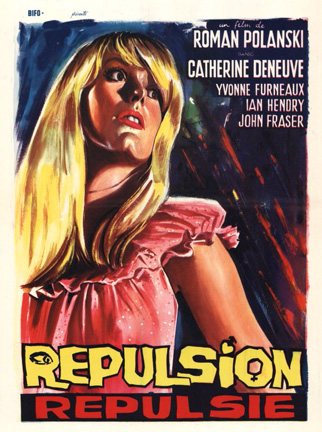
No Liberation for these Women: Repulsion


         The first two shots of Repulsion are exemplary acts of cinematic object-worship. They show Catherine Deneuve’s eyes, almost unblinking, as the credits scroll over her pupils. The character Denevue plays is Carol, and she is a woman who will be abused relentlessly throughout the film—by men, both real and imaginary, by her petty sister, by herself, and by Polanski’s camera.

            The story is simple enough to give the impression that the film is one elaborate film-school-ish exercise, or just a step-by-step manual on how to make a psychological thriller. Carol and her sister, Helen, live in a flat together in London and work at a Beauty salon. Helen has a boyfriend with whom she loudly copulates each night as Carol tries to sleep. Carol is a severely withdrawn, yet beautiful girl. A man asks her on a date and she accepts as if accepting something in a dream. She spends more and more time in her apartment, becoming obsessed with cracks that she notices all over the walls, with the constantly ringing phone and with the bizarre food she accumulates (though we never see her eating it). When her sister goes on vacation with her boyfriend, Carol’s madness intensifies. The cracks get bigger. The walls turn to clay. A stranger appears in her room and rapes her each night. Eventually, she will commit murder.

            Much of this is an excuse for good old pure cinema, of the shock-value sort, and it’s a good enough excuse. The rape scenes are silent except for a ticking clock (leaving the 60 Minutes theme open to very sinister interpretations). Polanski is obsessed with tracking shots of Deneuve, for no particular reason other than that they look impressive. The score uses jazz music extensively, sometimes with the tracking shots, sometimes with more surprising associations, like a murder scene. One shot lasts for some time past it’s legal expiration, in order to focus on several street musicians as they cross the street playing their instruments. There is no reason to believe that the filmmaker’s did not get a kick out of the sleek, unhinged mood of the film, and their cinema for the sake of cinema gives us a kick out of it, too. Yet the film, with it's skittering jazz score, fashion styles, and implication of the sexually liberated young person (not the protagonist), gives a whiff of the coming 60’s counterculture. It was made at the very start of the ‘swinging 60’s’ period, and this is part of the overall milleu.

            What is more controversial is the way in which Repulsion indulges in objectification and idealization of female sexuality. This is one of the most sexist films ever made, though not quite mysoginistic. Carol is an infuriatingly blank and vulnerable woman, yet she does have the guts to kill a man, and may have suffered abuse in her past. One of the men in this film is a genuine pervert; another is a well-intentioned guy whom Carol perceives as a pervert. Carol is simply horrified by men, and her levels of sexual repression are vast enough to be unbelievable—just look at how gorgeous Deneuve is—and ambiguous. Perhaps Carol is a lesbian, whose attraction to women only comes through in a scene when she is loosening up and laughing with, and almost touching, a female co-worker, before looking away in shame. Or perhaps she is terrified by mere physical contact, and the physical attributes particular to women; the potatoes that lie on her kitchen table come to resemble ugly, dead things, similar to fetuses. A family photograph hints at possible familial abuse from years before. The way in which the filmmakers handle this ambiguity is by relentless objectification of Deneuve; close-ups of her face and eyes as she is raped or grabbed by hands that come out of the walls; her increasingly skimpy clothing. Yet Deneuve asks for this sort of treatment by way of her freakish, trembling performance. How are we not supposed to project our interpretations of the source of this woman’ sexual repressions when she is so thoroughly uncommunicative and unceasingly mad? One thing Polanski fortunately does not do is turn the story in to a righteous pulpit so popular with stories of madness in the cinema: it’s not Carol who’s crazy, it’s the rest of the world that doesn’t understand her. No, this woman is simply, frighteningly unnatural. Repulsion falls firmly in to line with all the other films that objectify women and their sexual mysteries, going all the way back to D.W Griffith’s An Unseen Enemy and continuing with Ecstasy, Belle Du Jour, Deep Throat, and even Mulholland Drive. Repulsion may be the most unsettlingly proud film of it’s kind; it looks at a sex-object, builds her character through further sex-objectification and invites the audience to rejoice in it.(An Unseen Enemy, 1912)

(Deep Throat, 1972)(Ecstasy, 1933)

(Mulholland Drive, 2001)

Thursday, September 24, 2009

Something in 500 Words or Less

[I need to start reigning myself in on how much I write. Posts are sloppy and everywhere at once. Consider this a 'Motion Study', as I will be calling them. It is always meant to be brief and concise.]
Ozu's images are templates rather than finished images. In Tokyo Story (1953), cameraman Yuuharu Atsuta captures shots of a field on a hillside behind a house, symmetrically aligned with the roof at the point where the shingles complete its triangular slope. The sky is always clear and the time is always midday. In the first template of this image, a boy and his father stroll along the hillside towards the spot where the roof's edge aligns, and slowly exit the frame. Later, a man rides his bike along the hillside, disappearing from the frame as soon as he crosses that same spot. Another version of this template is simply an empty shot of the hillside, infused with no motion, and accompanied only by music.

         Ozu is one of the few filmmakers in history patient enough to work with templates for all his films and often not elaborate on the most bare bones form of the shot at all. It's emptiness merely repeats again and again. The camera rarely moves, though the motion within the frame is bittersweet and electrifying; and when there is no motion, the repetition of the shot later on itself becomes a form of motion (something few filmmakers consider), and still manages to stir us in our gut in addition to serving the narrative. Some might want to use a more professional term-- 'Master Shot'-- for what I am here calling a template, but it is not the same. A Master Shot is the basis for a scene, and close-ups, medium shots will follow within the basis of that shot. Ozu's templates are narrative links at the most practical level and bases for reflective motion at a deeper level. Most of the time, no close-ups or medium shots are needed. He used this formula of Template shots in many of his films, at least in the late period of his career, and it always worked in a way that could make another filmmaker slap their head and exclaim that the secret was right under their noses the entire time. Yet at the same time, when other filmmakers try to use this template format, it does not always work. Jim Jarmusch and Hsao Hsaio-Hsien have tried it to varying degrees of success. At best, it seems like an attempt to elicit wistful emotion from an audience when the story isn't cutting it, at worst, like an imitation of Ozu. As long as Ozu was a master of his own template, we will remember it's potential.


Thursday, September 17, 2009

An Insignificant Matter of DVD Distributors

In America we are up to our necks in DVD's from all walks of Movie-dom. We have bootlegs, pornos, tapings of monster truck rallies, public service announcements and how-to's, along with the Harry Potter movies and Godfather restorations. But there are only two companies that have the distinction of putting out quality movies in quality transfers on shiny new DVD transfers. These are the Criterion Collection and Kino on Video.
(The Great Train Robbery, 1902)
What is unfortunate about even this fact, though, is that it seems people forget about the latter. The Criterion Collection is considered, without a doubt, the premier distributor for foreign films, U.S cinema headed for posterity and everything in between. It is the voice of both the forgotten masterpiece (John Huston's Wise Blood) and the Hollywood film that bears reconsideration (Armaggedon?). It covers cult films (Equinox) and formal classics (The Red Shoes). Even despite the fact that the prices for the movies rarely fall below $25.00, who can resist, at least from time to time? All the special features and the crisp transfer make it worth the money.
But what The Criterion Collection can also be judged by is not all the dazzle it does include, but what it leaves out. If a DVD company is to proclaim itself 'A continuing series of classic and contemporary films,' then where is a contemporary film such as Jan Svankmajer's Alice? Where are classics such as The General, The Last Laugh, Napoleon or any of Griffith's films? Where is most of the bulk of silent cinema for that matter? And why are fine contemporary films from the like of Bela Tarr, Gus Van Sant and Michael Haneke ignored in favor of a trendy niche-machine like Wes Anderson (who's every single film has a Criterion release)? 
The immediate answer is: owned by a different distributor. To be sure, some of the classic films are completely un-attainable even for a prosperous distributor like Criterion because their' rights are already owned and will never be sold. Criterion is itself a subdivision of Janus Films, and so they must rummage through Janus's vault. But if Janus doesn't have it, then neither will Criterion. Yet as if to compensate for this deficiency, it seems that Criterion churns out as many films by a handful of coddled directors as possible; these directors include Akira Kurosawa, Ingmar Bergman, Jean-Luc Godard, Robert Altman, David Fincher and again, Wes Anderson. While most of these directors are titans in the world of movies without question, one gets tired of Criterion's agenda to release possibly all their films (they've almost done it with Kurosawa), as if to say; 'We know we should branch out. But look, here's this lesser Kurosawa film for another forty dollars.' We do not need a television series-- not a film-- made by Altman in the 80's, or a collection of Beastie Boys videos. And the constant reissues and box sets come to seem like even more tinsel being thrown at the consumer.

Kino on Video, by contrast, is a distributor which calls itself, more boastfully, 'The Best in World Cinema.' Obviously, 'The Best' is not literally true, but at least they are more straightforward about their target mission: World Cinema. Unlike Criterion, Kino is a crash course in silent cinema; they have released box sets of early short films by Edison, the Lumieres, Meiles and the like; they are responsible for an excellent double-DVD set of Griffith's short films and many of his features. Kino seems particularly fond of German silent films as well, having released and/or reissued expressionist classics such as The Cabinet of Dr. Caligari, Metropolis and Nosferatu. They are responsible for Svankmajer's surrealist masterpieces and, whereas Criterion has always had a preference for Tarkovsky, Kino has released the features of the too-often overlooked contemporary and (mutual) influence of Tarkovsky's, Sergei Paradjanov. (Kino does have DVD's of Tarkovsky's Mirror and The Sacrifice). There are often not too many special features on Kino's DVD's, but this can be seen as a blessing rather than an inconvenience, as it forces the viewer to confront the film in it's bare form. By contrast, a two hour conversation with Akira Kurosawa and two separate audio commentaries on the Seven Samurai are distractions to the point of being dead weight. Criterion likes to pride itself on releases of films by underappreciated, or damned-near unheard of filmmakers, such as Whit Stillman (Metropolitan) or Bruce Robinson (Withnail and I).  Underappreciated, perhaps, but even these films are ones which had an established-enough cult following, played at major film festivals and are not too far removed from the conventions of a certain supposed-movement (the American 'Indie,' for example). Kino, by contrast, is for the true cinephile, the filmgoer who wants to go further in to the rabbit hole and see things he really has never heard of.  Who has ever heard of the recent American independent The Toe Tactic, a mixture of live-action and animation? Who ever knew there was a celebrated Russian filmmaker named Karen Shakhnavarov? Kino enables the dutiful cinephile to discover these sorts of films and filmmakers.
The Criterion Collection does deserve much credit for what they have done for films-- in terms of restoration, they really are the best, and at least they have a DVD edition of the greatest of all silents, The Passion of Joan of Arc, and other movies that are genuinely obscure (W.R: Mysteries of the Organism) or overlooked (Clean, Shaven). Part of my gripe with Criterion may have to do with the fact that they know their audience so well, it's obnoxious; affluent, hip, probably urban dwelling folks who, I am guessing, are by and large younger than forty. But Kino is the more mature distributor, and one which gets directly to the point-- that is the films themselves-- by a less pretentious and puff-piece type of approach. While Criterion is the examplar of cinema conservation-- again, note their restorations and transfers-- Kino's commitment to silent cinema makes it at the least it's equal, just on a somewhat different turf of conservatism. The Criterion Collection is for starry-eyed indulgers; Kino on Video is for practical graduates.

Sunday, September 13, 2009

The Hungarian Pan


The Hungarian Pan


   When, in the histories of Cinema and Oppression, has a particular type of shot slipped from the tyrant nation in to the oppressed nation? The immediate answer one may want to give is now, and for the past thirty or so years, and that country would be America. America has had not just one type of shot but an entire array of Hollywood conventions adapted by the rest of the world, for better or for worse (and the implication is usually that it’s for the worst). Yet this is simply a sub-argument of the greater subject of U.S imperialism, and the U.S, for all its’ cultural imperialism, has never done to a country what the Soviet Union did to Hungary. Of course, what the monstrosity of the USSR did to all of Eastern Europe is notable, but here Hungary an exception, first of all, because of the total cultural beating it took; suppression of the Hungarian language, bans of books by beloved native authors who did not fit the socialist cause, official, state approved art, and virtually zero political independence from Moscow, even when other countries were being slightly liberalized. The other reason Hungary is particularly notable is in the way it’s cinema changed in this period. It changed because of one final imposition made by the Soviets, even if it was probably an unconscious one. This was a particular type of shot, more accurately a camera movement, known the Pan.

            The Hungarian Pan can be exemplified by one or more images from six different films from the period of 1960—the present. These images, and the films which they are from, are:

1.     The Round-Up (1965): Black and White. Miklos Janco’s camera moves left to right down the lines of prisoners, in their filthy clothes, their faces dirty, their spirits weakened as they stand in line in front of the Hapsburg soldiers, in the rain. The camera progresses with the militaristic cold of the Austrian soldiers, yet there is a hidden empathy of which the viewer is always aware.

2.     Father: Diary of One Week (1966): Black and White. A pan of a young man running across a bridge in stops and starts, rifle in hand, ducking below the concrete banister as gunfire from the Soviet tanks sporadically booms from the city. The street is deserted except for him. Several cuts to closer shots of the man, but always a return to the fitful pan.

3.     The Red and The White (1968): Black and White. Sounds of gunfire. A renegade soldier moves backwards aside a rickety wooden fence, firing his rifle at oncoming Russian soldiers. Pan with him along the fence. He dodges into some shrubbery beside a marsh where several other Hungarian soldiers wait. The Russians overtake them and the man runs in to the water. A general or commander asks him to step forward. Pan back in the opposite direction, on to the grass again. The Russian soldier asks the man if he is Hungarian and the man replies that he is. He is told to run back in to the water. He stares at the commander in fear as the commander wades in to the marsh, pulls out a pistol and shoots him dead.

4.     Damnation (1988): Black and White. Accordion music. Another line of sorrowful faces, but this time they are peasants, farmers and other assorted townsfolk who gaze in to the camera with a defiant bitterness at their lot in life. The pan starts with rain, but this rain is more like a bucket of dirty water that pours down the gray wall in sheets. Camera moves past one section of peasants and farmers divided by a narrower wall. Then comes another section of peasants and farmers. Following them is another wall, on which another bucket of dirty water falls.

5.     Hukkle (2002): Color. A lazy, sunny afternoon in late spring or early summer. An makeshift outdoor bowling alley, put together by idle villagers. One man steps up to the start of the rink and shoots a ball down the alley. It knocks over the wooden pins and the villagers cheer and stand. Pan from left to right with the ball, as the villagers move about and one collects the ball. Stop at the three bowling pins. This shot repeats itself twice, in slight variations.

6.     Tranquility (2008): Color. At the start of the film, a door opens in a quiet and dim apartment building in the early morning. Through the warped glass of a windowpane, we pan with a man as he rushes across the hallway. Stop when he walks out the front door, slamming it. Later: Pan with the same man as he runs across the Elizabeth Bridge, linking Pest to Buda, towards the Buda side to go home to his sick mother. The Danube River cuts through the background. He stops for a moment, then turns and starts running in the other direction.


Each pan is slower than the average pan. These pans depict images linked by bridges, poverty or violence. The precision of the individual camera movements have some surprising relationships in rhythm: while several are a simple left-right or right-left dolly, the pans of Miklos Jancso (The Round-Up, The Red and the White) and Bela Tarr (Damnation) are deliberately complex, starting from one direction, moving as far as they can, turning around and moving far in the other direction, transforming in to far more than a pan. Theirs’ are shots that drive at some sort of fulfillment that is always held at bay by hunger and chaos, and each of their films is built from these set-piece style shots. The pans of Gyorgy Palfi (Hukkle) and Robert Alfoldi (Tranquility), on the other hand, are pans that are both strictly functional and consciously in debt to the films that preceded them; though one can only get a sense of this by watching the films. Every pan gives the impression of trying to stave off doom; perhaps this is why several are so fitful. The doom derives from the content: in Hukkle, from the inevitability of another villager dying from a poison that is contaminating their food; in Father, from the fact that the rest of Budapest is in turmoil, and the protagonist could be next. But the doom is symbolic of the country’s struggle during the Soviet era, and in practice it is a clear attempt to not only stave off doom, but also create a national cinematic conscience.

Back in the tyrant country, the U.S.S.R, in which this slow, poetic movement was engineered, filmmakers who used these pans were a mixture of rebels and conformists. Andrei Tarkovsky, son of the renowned poet Arseny Tarkovsky, was a student at the state film school VGIK, where he began honing his long-pan oriented style. From Ivan’s Childhood (1962) onward, and especially in his masterpieces Andrei Rublev (1966) and Solaris (1972), he became the anointed master of the long take, the only comparable director perhaps being Antonioni. Yet Tarkovsky’s long takes were roaming, constant pans, not the stolid social realism that was the norm in the Soviet Union. His films were firmly anti-social realism, and appear to be more influenced by painting—especially icons and triptychs—in their visual styles, as well as poetry. They could not have possibly been made were it not for the liberalization policies of Nikita Kruschev, which allowed for more freedom of expression amongst artists.

At the same time as Tarkovsky, however, there was another film called I am Cuba (1960). This film was a state approved and funded propaganda piece about the Cuban revolution and the beauty of that country’s ideals. Yet the film is only Social Realism in the sense that it promotes Socialism; it rejects the traditional social realist filmmaking of Eisenstein and Vertov in favor of the same long, roaming pans of Tarkovsky. At the film’s opening, the camera tracks along with a man standing in his fishing boat, coasting along a shallow river with the occasional stroke of his paddle. Later, it tracks through a nightclub and still later, down the steps of the Cuban Parliament, in what may be a somewhat ironic homage to Eisenstein’s Odessa Steps sequence in Battleship Potemkin (1925). The film is gorgeous to look at, yet it is still a piece of propaganda; a surprising piece of propaganda at that. The very fact of its stylization is evidence that even this film could not have been made without the same effects of the liberalization period under Kruschev. This is the very same reason Hungarian filmmaker’s were able to develop their own brand of the pan; Khrushchev was slowly, cautiously, allowing them to aid their cinema.


Still, did Hungarian filmmakers really ‘take’ their pans from the Soviets, or did the two countries simply develop the same aesthetic at the same time, by coincidence? It’s a fair question to ask, and there is some evidence of Hungarian filmmakers showing a flair for the pan as early as 1956, in the national classic The Merry Go-Round. The pans in that film—of a happy girl on the spinning Merry Go-Round of the title—do not bear much technical or thematic resemblance to the pans that came later, though. The question becomes irrelevant when we consider how the Hungarian Pan is and was always more meaningful than the Soviet Pan—or any other filmmaker’s pan. In the Soviet Union in the 1960’s and 70’s, films were either propaganda (I am Cuba) or anti-propaganda (Tarkovsky’s films). In Hungary, movies were about the vagaries of existence, about survival and yearning for freedom, and many still are. The Hungarian Pan reflected this theme; in fighting the Russians and the Austrians; in the hesitation of whether or not to return to one’s ill mother; in the dirty faces of peasants and the work they do.

.

Yet the two filmmakers mentioned here who have truly utilized the Hungarian pan to it’s fullest potential are first Miklos Jancso and then Bela Tarr. Both have made the long, roaming pan one of their trademarks in film after film and Tarr has freely admitted to Jancso’s influence. Does the pan then belong merely to these two filmmakers and not the whole of Hungarian cinema? A fair answer is no; Jancso has made most of his films about a part of Hungarian history, and so his cinema—and therefore it’s means of expression—is intentionally, unabashedly nationalistic (that The Red and the White was a co-production with Russia is also symbolic). Tarr’s best known films are expressive of life in Hungary’s Alfold, or, Great Plain. While not nationalistic, he is representative of his country’s cinema these days, and more recent filmmakers such as Kornel Mundruzco (Delta) have strongly taken after him. Tarr and Jancso are the towering individuals of Hungarian cinema; the pan, by the very nature of their films, remains national.

In Russia, filmmakers such as Alexandr Sokurov and Andrei Zvyagintsev have continued the tradition of the Russian pan, in obvious debt to Tarkovsky. In their films, there is not a single Hungarian. Their films follow the painterly framework created by Tarkovsky. In Hungarian Pans, though, what is most striking is not the simple aesthetic beauty of the shots, but oppression, which is implicit if not overt. Russians feature in their pans not infrequently, and the most menacing pan of them all may be from the footage shot in 1956, by an amateur or news cameraman, of Soviet tanks rolling through Budapest. The grainy Black and White footage veers from left to right as a tank dotted with white stars rumbles through the rubble of Budapest, part of a long line of tanks. This image, like the other quintessential Hungarian Pans is un-painterly, and speaks of a form of oppression. This oppression was very real for the Hungarians for many decades, and perhaps the best Hungarian filmmakers can still feel it. It has created a shot that is the one thing for which we have to thank the brutal and extinct regime known as the Soviet Union.


Thanks to:

The Hungarian Cinema: from coffee house to multiplex, Chapters 6 and 7; Cunningham, John; Wallflower Press, 2004.

For assistance in with writing this essay.


Films Noted and pictured are:

--Szegenlegenyek (The Round Up): Dir: Jancso, Miklos. Scr: Hernadi, Gyula. MAFILM IV, Jatekfilmstudio, Hungary, 1965.

--Apa: Egy Hit Naploja (Father: Diary of a Week): Dir: Szabo, Istvan. Scr: Szabo, Istvan. MAFILM IV, Jatekfilmstudio, Hungary, 1966.

-- Csillagosok, Katonak (The Red and The White): Dir: Jancso, Miklos. Scr: Hernadi Gyula, Jancso, Miklos. MAFILM/MOSFILM, Hungary/Russia, 1968.

-- Karhozat (Damnation): Dir: Tarr, Bela. Scr: Krasznahorkai, Laszlo, Tarr, Bela. Hungarian Film Institute/Mokep. Hungary, 1987.

-- Hukkle: Dir: Palfi, Gyorgy. Scr: Palfi, Gyorgy. Mokep. Hungary, 2002.

-- Nyugalom (Tranquility): Dir: Alfoldi, Robert. Scr: Alfoldi, Robert, Gyaraczi, Laszlo, Berenyi, Betti (from the novel by Atilla Bartis). Magyar Televizio/Unio Film. Hungary, 2008.

-- I am Cuba (Soy Cuba/Ya Cuba): Dir: Kalatozov, Mikael. Scr:Barnet, Enrique Pineta, Yevtushenko, Yevgenyi. Goskino/ICAIC. Russia/Cuba, 1964.
Wednesday, August 26, 2009

On Bravaura Storytelling


District 9 is a film spilling over with anarchy and nihilism, though maybe the filmmaker’s didn’t know it.

The director is Neil Blomkamp, a first-time feature director and native of South Africa who made the film with the ‘small budget’ of $30 million, much of it on loan from producer Peter Jackson. Jackson let the director cut loose, and there are as many explosions, gun-battles and shaking cameras as one could squeeze in to such a film, though all are framed by an uncommonly clever story. A massive alien spaceship has been hovering over Johannesburg for over twenty years, while it’s crew, comprised of thousands of insect-like, tentacled aliens have occupied the ghettos of the city. By 2010, the government and residents of the city have become fed up with the aliens and a team is created to deport them from their current occupation in to a designated site called District 9. The team is led by Wikus (Sharlto Copley), an irritating, arrogantly jovial man who may have been hired for the job simply because he is married to the daughter (Tania Haywood) of a top government figure. Naturally, the aliens are uncooperative and Wikus is not the right man for the job; but once he accidentally swallows a brown alien substance found while raiding one of their shacks, he slowly begins to transform in to one of the aliens (known as ‘Prawns’) himself, and becomes a target of the government. While on the lam, he is forced to rely on the alien in whose shack he found the substance, and who claims he can turn Wikus back to normal.


(Map of District 10, Johannesburg, South Africa)

One of the most memorable snippets of the film is one that occurs by-way of Blomkamps storytelling form of choice; a mixture of straight documentary, sequestering the action-packed plight of the rest of the story. The snippet is in a documentary segment near the beginning, in which a T.V commentator is talking about the plan to take care of the aliens, and mentions the opposition of human rights groups. There is a quick shot of activists holding signs and shouting in the streets, and in the context of this story it seems completely zany, but it is meant to be taken at face value. Because District 9 is almost a merely inspired, bombastic science fiction film that adheres to the pulpiest aspects of the genre, except for one thing; it’s an allegory of Apartheid. Blomkamp deserves credit for choosing such an ignored subject of cinema and framing it in such a peculiar way, but the internal flaw of the allegory is that those were Humans and these are Aliens. By way of it’s documentary realism, the film is asking us to remove ourselves from entertainment and seriously consider: What if Aliens landed here on Earth? It’s own answer to the question only begins with the shot of human rights activists, and although hilariously accurate, Blomkamp doesn’t want us to think it’s hilarious; it is just dead accurate. These people on the margins, these protestors, have the right idea about how to live with these creatures, while the majority of South Africans are prejudiced and the totalitarian government simply has it’s own agenda. But when I considered what would happen if aliens really landed on earth, I quickly realized that I would fully support a plan to get them out of here as quickly as possible. The aliens in this film are mostly portrayed as brutish and not very intelligent, have been hanging around for over twenty years, and posses weapons; some of them kill. With all this considered, a program to put them far away from human civilization looks reasonable enough. That one alien (and his cute son) do gain our sympathy in the film, as we spend more time with them, does not save the overall allegory. Blacks are people and are entitled to human liberties; aliens are intruders, and their predicament makes human rights activists look silly.

Yet what ensues is far more, even, than a socially conscious sci-fi action film. District 9 contains, as one other critic put it, ‘bravura storytelling.’ This is ultimately the emotional sum of its parts. On one hand, it’s story is indebted to the stories of trade paperback science fiction magazines of old that have now been consigned to used bookstores and special collections. Yet those stories did not utilize grainy surveillance footage, CGI-created characters, or T.V imagery; in these respects, the story is indebted to modern technologies. Also thrown in to the mix are the slow-motion shots that occur in films when a character is getting ready to take care of business, and a token baddie, ordered to capture Wikus, who comes in to the film late and acts as if he’s at a frat party the entire time. Given this intense mixture, Blomkamps storytelling approach involves both caricatures and fleshed-out characters, genre clichés and inspired visual sensibility. 

All bravaura storytelling encompasses both talent and fault, and there are several major talents at work here; one is the lead actor Sharlton Copley, who manages to hold every scene he’s in back from all the  CGI and gun-battles and misguided satire. He is a true performer who does not need to be an action hero to make us keep our eyes on him, even in spite of his ridiculousness. And the cinematography, by newcomer Trent Opaloch, can be a real visceral wrench; watch as he cuts back and forth between Tania being assured by her father that her husband is dying and she has to ‘let go,’ and shots of Wikus being wheeled, screaming, in to a spooky government operating room where his surgeons intend to cut his heart out. But bravura storytelling needs to be anchored in fundamental storytelling, and District 9 fails to follow through on several of its fundamentals. All allegories must be logically reconciled with that which they represent in reality; all clichés and caricatures will not necessarily be mitigated by the audaciousness of other aspects; and all those protestors may be where the actual satire resides.


Wednesday, August 19, 2009

I Met a Murderer


In 1939, the forgotten English filmmaker Roy Kellino made a home movie with his then-wife, Pamela Kellino (later Pamela Mason) and an unknown actor in his late 20’s, James Mason. Kellino shot the film himself, in the farmlands of Northern England; he and Kellino and Mason collaborated on the story. The result was an eighty-minute thriller called I Met a Murderer (1939).

The film, which screened at Film Forum as part of its Brit Noir series, must be the WASPiest B-Movie ever made; replete with images of farm dogs running over the hills, farmers carrying rifles and pipes, wooden bridges crossing over brooks and stone-leaden architecture. It is also, for its time a conventional film. Conventional here is used in the best sense of the word; it adheres to various melodramatic traits of studio films of the time (and to an extent, today). It features an orchestral music score almost throughout the entire film, and has customary close-ups of the actor’s faces at the right moments. It’s story is one of extreme formula; a man-on-the-run story that Hitchcock was riding to the hilt at the time. In this particular version, Mason plays a dutiful, hardworking farmer with a wife who can’t stand him or his farm anymore. In retaliation against his strict rules and treatment of a somewhat dim farmhand, she shoots his beloved dog. In retaliation, he shoots her. Although he plans the stay on the farm, his neighbor’s daughter is finds the spot (not very inconspicuous) where he has buried his wife and starts digging. The last shot of Mark we get is of him is a distant fade of him jumping a wooden fence and running away from his farm. From that point on, he is on the run from Scotland Yard, but along the way he meets another wayward soul named Jo—a novelist of all things-- played by one of the most gorgeous women to appear on the English-speaking screen, Pamela Kellino (later, Mason). Jo acts as if she wants to aimlessly frolic and vaguely seduce Mark. But Jo comes to be revealed as a most unusual femme fatal who knows exactly what his predicament is, and is using him as fodder for her own imagination.

I Met a Murderer feels like it is a series of sequential ideas for a story shouted out by friends on a long car trip. Yet it still visually adheres to the story; first in the wide-open vistas of Mark’s farm, then in the slow pans and dolly’s through the countryside as Mark and Jo run from the law. But within this form, there are various stylizations that would not appear in mainstream films for several more decades; the camera zips from an object to a characters face at intense moments; animals are featured prominently as things that humans use Each scene starts with a conventional establishing shot before delving in to any specifics, but this is because the locals ask for it; this region of England, blanketed by hills and lapses of forest, by mellow streams and farm after farm is the least typical place to set a chase film. Its sheer beauty does not need color to be admired, and rural set mysteries or chase films such as Fargo or Badlands come to mind from time to time. As with those films, Murderer uses the landscapes as one with the psychology of the characters, though to a far more subtle degree. This is unusual for such a low-budget, often campy film, and is perhaps Murderer’s most admirable attribute.

Unfortunately, what tends to cut into the film’s visual obsessions is its awkwardness. In the scene where Mark and Jo first meet, on a rainy night under an overpass, she offers him a cigarette, but takes none out of her pocket; he offers her one of his own, but she says she does not smoke; she has been standing in a tentative position, as if over-excited; then we see a sudden close-up of her in which she seems to be standing rigid position and the background looks different. The awkwardness in this scene stems from the visual, the written and the actor’s gestures, and it glares elsewhere in the film; Jo’s hairstyle, for example, seems to change from shot to shot. The exposure is not always good (the film was shot entirely on location, rare for it’s time) and frames are missing from the print. Not all of these faults are necessarily faults of the filmmakers, and much of the time it is hard to care anyway. In one scene, Jo and Mark are pulled over by two policemen for speeding. Jo gets out of the car and seductively apologizes to the officers for her mistake. The affect she has on them is the same affect she has on the audience; in clear view of all the errors, we just let it go.


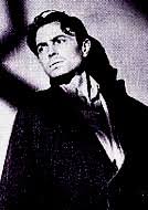
(James Mason, I Met a Murderer; Director Roy Kellino.)

I Met a Murderer is an imperfect yet genuinely independent film from a long time ago that bears interesting similarities with the low-budget Indies of today. As with many Indies today, it is overstuffed with ideas, imperfectly acted, imperfectly shot, but endearing nonetheless. This appears to be the ideal feel for an independent filmmaker’s debut; Jarmusch captured it with his early features, Wes Anderson captured it in Bottle Rocket, and even a movie like Napoleon Dynamite was greeted the-imperfect-little-film-that-could. But unlike those movies, I Met a Murderer did not accept any particular niche audience that it will appeal to. It did not take the quirks of previous movies and update them for it’s own style, either. Murderer comes from a time when there was no such thing as niches in a large-scale sense and the main duty of a filmmaker was to tell an interesting story and tell it so people could understand it. This is probably the ultimate convention Murderer adhered to, and in this way it can both be labeled a ‘B-Movie’ and is just an entertaining story. If more independent filmmakers simply returned to conventions these days and stuck to their stories rather than their quirks, perhaps we could have a real independent film resurgence. Convention is the lifeblood of storytelling. 


(Pamela Mason)