Thursday, December 29, 2011

The Girl with the Dragon Tattoo


(Rooney Mara in The Girl with the Dragon Tattoo/2011)
         
          The Girl with the Dragon Tattoo has a highly addictive soundtrack. It has Sharon O belting out Led Zeppelin’s “Immigrant Song” with Trent Reznor’s techno blabber to match it up. It has her screaming erotically towards the end. The remainder of the film features droplets of trancey techno, and one darkly humorous usage of Enya’s “Sail Away.” This music lends the scenes it is matched to a distinctive thump; that sort of conniving sense you get, when all your senses are taking in too much at once, that the images in front of you are leading to something. Is it a distressing sign that they so often lead to nothing? What of The Girl with the Dragon Tattoo, which is all thump and no sense whatsoever?
            It seems tedious to summarize the story, again. We all know about Stieg Larsson’s smash hit of a trilogy, or at least it feels like we do.  Some may be unfamiliar with the story of Mikael Blomkvist (Daniel Craig), the disgraced Swedish journalist who is hired to find a missing girl from a wealthy family, and Lisbeth Salander (Rooney Mara), the antisocial youth heroin who is raped by her case worker, exacts bizarrely horrific revenge, reports on Blomkvist himself, and eventually teams up with him. For these Tattoo virgins, this film might look like a revenge-fantasy turned feminist action movie, with insistent diversions on journalism, Nazism and cyberpunk ethos. That is not a bad distillation of the book or the Swedish film, either, but the problem is that it’s a distillation, period. The book sustained itself as hugely entertaining trash mainly due to the thrill of watching it become about this disturbed mystery girl, and because of the kinky, genre-laden grab bag that constituted its structure. The whodunit, the family saga, the revenge thriller, the sadomasochistic horror story; all these genres were thrown in by Larsson; the story that emerged was a thrilling mess. Film is better at getting away with making a thrilling mess of genre than literature. Lighting can go from high contrast to low contrast, cameras from static to handheld, costumes from shiny to bloody and nobody gives a hoot so long as it flashes across the screen. Director David Fincher seems only somewhat more willing than Niels Arden Oplev (director of the Swedish film) to let his film be a mess; what both directors unwisely chose to do was smooth out the narrative sloppiness, which is, if anything, more than half of the story’s ridiculous charm. The weird family dynamics gradually explored in the novel are skimmed over; the sense that Lisbeth Salander is actually a fractured individual who gets sucked in to being a hero is replaced by the idea that Salander is a hero. With her black, close-upped to death motorcycle and helmet, her dark attractiveness (this person is meant to look un-pretty) and her perfectly timed one-liners, Salander is a movie archetype, not a genuine outcast who becomes an archetype. One gets the sense that the filmmakers and actors understood this progression, but they didn’t feel like communicating it. Motorcycles and explosions and extensive rape look better.
(Rooney Mara in The Girl with the Dragon Tattoo/2011)
(Daniel Craig and Christopher Plummer in The Girl with the Dragon Tattoo/2011)

            The main issue, though, is that David Fincher has no patience. For a long time now, he’s been the most intimidatingly revered director in North America. He is the type of director lauded in film schools for his technical precision and perfectionism; critics and audiences love him for his ‘ability to cut to the chase’ and the way he rebels successfully in Hollywood; he gets final cut, he works with whichever actors he wants. But is Fincher a perfectionist or an opportunist? He takes the entire range of ‘film language’ so literally that to him, any story can be told with any degree of technique. That technique usually means an unmitigated kineticism that gives his films the feel of very long music videos and not cinema. This might explain his admitted talent with music (he started off directing music videos), but it doesn’t explain how he gets away with making such straight-jacketed films. For a director who apparently utilizes storyboards so well, his films are the excess of just that; Fincher has never met a shot that does not look like it was once a storyboard. The result is that his images are sleek moving panels, not moving imagery. They do not require one to see for themselves what’s unfolding. We need not be interested in delving in to the particulars of his style; Fincher strapped it to our eyes. This dishonesty, this pure arrogance does not go away in The Girl with the Dragon Tattoo, and it doesn’t look like it will go away over the course of his filmmaking. He’ll continue to get away with it, and continue to get a free pass on his essentially cold and clinical filmmaker’s soul. He’s the most intimidating major director today, and the most depressing.
            The Girl with the Dragon Tattoo is a franchise movie. Whether or not it matters what the sequel will look like is now entirely in the hands of studio executives. The franchise movie might be its own very perverse genre by now; the newest Batman film will be rolling out next year, along with at least two others. They are product movies; they showcase certain music, brands, and lifestyles the average viewer may wish to follow. They are shiny; the cinematography is unblemished, un-ironic. Every character, even the bad guys, is essentially a hero in their uncomplicated way of fitting in to the film’s world, and the popular imagination. Lastly, they are cash cows; they make a lot of money. But no franchise film has yet transcended the concept of the franchise film. With Stieg Larsson’s books, it felt like we had material that was begging to be franchised in cinema, but which, more importantly, might be that transcendent film. Multiple plotlines, a broad, bombastic sense of social commentary, characters in trouble in their lives rather than in the mere mission they are assigned to; this is the stuff of an exciting franchise film. And when asked whether we should prefer the Swedish film or the American film, the answer looks irrelevant. The only realistic answer is that we should scrap it all and start over.
 

Thursday, December 22, 2011

Worthwhile


I am not going to make a top-ten list of the best films of 2011. I outright, point-blank refuse. However, here is a list of some films I saw this year that I believe may be more worth viewing than most others. This is not to say they have any heirarchy, any immediate standing in the history of cinema, or that I'm right at all. It means they were films that, due to my enjoyment of them, seem to have used the form in a methods that are startling, risky and interesting. Because of those three essential qualities, they may or may not have contributed something to the larger sphere of moving imagery.


The Skin I Live In
The Tree of Life
Uncle Boonmee Who Can Recall his Past Lives
Shame
Lemmy
Without
Possession (originally released 1981)
Le Quattro Volte
Melancholia


Which films did I forget? Possibly several. Which bad movies are worth talking about? None.

Sunday, December 18, 2011

Films: Vampire Cuadecuc


(Vampire Cuadecuc/1971)
            You just have to let Pere Portabella’s Vampire Cuadecuc (1971) fog its way through you. The second half of the title refers to the tail end of a reel of film; the part where frames get bleached out. It’s an appropriate title, because it can feel at times like we’re watching stolen images from that forbidden end. Portabella overexposed some shots, blurred-out others, mashed together a sound mix that sounds like it comes from a basement (a basement with a sense of humor), and allowed his documentary on the making of the notoriously schlocky Jess Franco film Count Dracula (1970) to be a documentary only in the sense that it questions that very term. This oddity is more of a 67-minute element. You observe it for what feels like a while, then it’s gone.
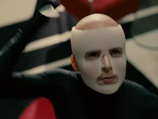
            The main players in Vampire Cuadecuc: Christopher Lee, the star of Count Dracula (1970); Maria Rohm, a Franco regular who plays Mina Harker, the much distressed love-interest in Bram Stoker’s story; Soledad Miranda, as Lucy, her friend with lesbian overtones/undertones; Herbert Lom as professor Van Helsing; and various cameramen, makeup artists and extras. These main players are seen mostly in footage from the actual film, but shot in black and white and from differing angles, making the film an interesting comparison piece to the actual narrative film on the most superficial level. But Portabella is not too concerned with making a comparison—or a companion—piece to the work of filmmaking it portrays. He is after something more self-conscious and nightmarish. As the credits state, the film is based on an ‘idea’ by Portabella and Joan Bossa. What that idea is, beyond the idea of documenting the making of a film, may be to create a horror-document, rather than a made-up scary story. The film is dotted with shots of Lee grabbing a swooning Rohm and biting in to her neck, followed by the camera operator circling in to the frame. It shows detached hands—never the bodies they belong to—dusting Lee’s face with makeup before he settles down in to his coffin to continue his ungodly vampire existence. As Dracula creeps around his large parlor, talking to a mystified Jonathan Harker, who has just arrived at his castle, the camera pans to lights in the background. But those are not lights of a film set. They are spidery technological enablers of a vampire. Those are not quite hands of paid artists on a film set either, or camera operators trying to tell a story. Indeed, the most peculiar implication of Vampire Cuadecuc is that all the main players—actors, technicians, objects, elements—by creating fictional evil are in fact enabling actual, abstract evil. This must have been Portabella’s overarching idea and his inquiry in to this weird game looks, literally, almost black.
(Vampire Cuadecuc/1971)

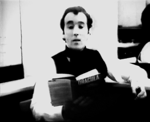
            It is because of the seemingly critical nature of Vampire Cuadecuc that some have read in to the film an allegory of Franco’s regime (the dictator, not the director, though the coincidence is amusing). But this interpretation is beside the point when we get down to the real meat of Portabella’s imagery. Practically speaking, he aimed to recap the story of Dracula via documentary filmmaking. This he did, but along the way he was boldly unafraid of experimentations with sound, with film stock, and with the apparently serious-minded nature of his project. Vampire Cuadecuc is not afraid of making a joke, or admitting that it’s all just a film after all. Near the end, we are treated to shots of the cast and crew gathering on a wide stage for what looks like either a break or a celebration, followed by Lee removing his fake mustache and his plastic eyeballs with a certain bemusement. The last scene is of Lee sitting in his dressing room, reading from the final pages of the original novel in a surprisingly mannered actor’s voice. That we realize this was all just a story being told is either a cop-out on Portabella’s part, or an admission he had to make to save his film from criticisms of pretentiousness. Whichever it is, his film is a dazzle; today, it is treated as both an obscure artifact and a provocative work of pseudo-non-fiction. It is concerned with the art of creation rather than the art of journalism or politics; it prefers wild images, at times for the sake of wildness, to the concept of sticking to the main theme. There is no main theme; there are only main rhythms, repetitions, objects, and faces. Vampire Cuadecuc is a document to be experienced; it fogs its way through you.
(Christopher Lee in Vampire Cuadecuc/1971)

Sunday, December 11, 2011

Motion Studies: A Celebration


(Possession/1981)
          
         For Isabelle Adjani in Possession (1981), a slow miscarriage against the backdrop of an ongoing tunnel of the German subway system need not be a simple performance piece. It should be a feat of full-body conniptions, and by extension, a celebration of bodily derangement. She starts off looking distrught as she exits a subway and walks in to the tunnel carrying a brown bag. Then she cackles to herself. She moves further in to the empty tunnel, a stretch of grays and blacks that curls around in strange reminiscence of other images that populate Andrejz Zuwalski’s film. When her cackles turn in to strange noises of pain, it is like watching a seizure as opera. When she smashes her bag against the wall of the tunnel, and it spews white material everywhere (what is that?), it is like watching forbidden performance art. When she falls to the floor and rolls around in the white residue, now a victim of spasms that must lead to something horrible, it is like watching something a woman might privately fantasize of doing to relieve frustration. When, in the next shot, she finally miscarries some ooze of blood and yellow murk on the tunnel floor, it is like watching this celebration come to an end we still didn’t want to consider. But it was inevitable.

Sunday, December 4, 2011

Shame


(Shame/2011)
           

               The Irish filmmaker Steve McQueen looks to have a fairly histrionic career cut out for himself. He has so far made two films with singe-word titles suggesting undesirable states of being, both of which are about, imagistically and thematically, emotional excess, physical collapse, crying, persistence in the face of sheer madness, shit, metal, granite, self-destruction. To believe that he does not get a joyride out of his beautiful moving photographs of male (so far, male) misery would suggest that, as a filmmaker, he has nothing in common with the compulsive, emotionally flattened protagonist Brandon of Shame. But in spite of the fact that the instincts of Brandon and McQueen are similar, Shame is not self-expression, it is not a portrait, it does not have a message. I don’t know what it aspires to be, but at least it’s enthralling cinema.
            Rather than make a work of art-film porn, as was the case with his first film, Hunger, McQueen has this time opted for an art film about porn. Brandon (Michael Fassbender) is a Manhattanite with a nice apartment in Chelsea, a white-collar office job, an interest in classical music and Don DeLillo novels, a reserved but charming demeanor, and an out-of-control addiction to sex and pornography. The latter trait is one he keeps private, but not too private. When he goes out for a night on the town with his boss (James Badge Dale, whose contribution to this film must not be underestimated) and some coworkers, he manages to pick up a pretty blonde who snubs his boss; later, his boss returns his computer with a clean hard-drive and observes to Brandon that his had drive was ‘filthy.’ At the same time, Brandon’s estranged sister Sissy (Carey Mulligan) has shown up in his apartment, bringing some of her own emotional baggage and interrupting his cultivated regime of sexual release. This inevitably causes Brandon to lash out at her—though it also forces him to violently reassess his priorities. This reassessment is accomplished in one frantic, somewhat funny montage of Brandon dumping every porno magazine he has stashed in his closet, every sex toy and picture and finally, his laptop, in to a trash bag which he plops on one grimy sidewalk of many in New York.

            After this point, the film becomes a brisker and more conventional narrative in which we start to fully root for Brandon.  He takes a real girl, Marianne (Nicole Beharie), on a real date and tries to form a real connection. This development is a welcome step forward for Steve McQueen, who directed Hunger toward a tiresomely rigid conclusion. He allows Fassbender to explore his character in front of our eyes; this is because the character, Brandon, is exploring his own character in front of our eyes. This is one of the more enjoyable ways to watch an onscreen performance. But it is not to say there are not still problems with McQueen’s style; at its worst, Shame looks like a very expensive student film. A sex scene against a brick wall with the word ‘Fuck’ scrawled on it, and a melodramatic conversation between Brandon and Sissy in front of their television, which plays a cartoon, shows that McQueen is still not above kitsch imagery. But there isn’t far too much of it and Fassbender’s grace as a performer actually elevates some shots that might otherwise be kitsch in to the realm of film poetry. When he stands alone on a Chelsea pier in the pouring rain, tears at his hair and collapses in to a puddle, it isn’t just an image of a man at the end of his rope; it’s a fall on to hard, wet ground.
            For all its seeming agenda—it explores a taboo subject! Millions suffer from this disease!—Shame quietly manages to avoid the trappings of an agenda film. It is not quite The Lost Weekend of sex addiction films, because it is not really a film about sexual addiction. It would not be too trite to call it a variation on the theme of a man who wants to escape himself, finds a woman who fails to help him escape, and slides back in to his torment even further, before seeing, maybe too late, some kind of clarity. In other words, a tragic love story in Greek drama form. Its attention to detail lets it stay grounded in the reality of New York life; the black grime of the subway tracks, the way walk signals, broken lights and broken trains constantly delay us. They also keep the story moving, and what more can we ask from a film? 

            But all this sound construction is not even what makes the audience leave this film so quietly, and with such shellshock. It is the profound sense of loneliness one gets from the eyes of Brandon, and from Sissy. It is from the reckless anxiety one senses in Brandon’s boss and the quieter anxiety we feel in Marianne. We can’t be sure if there’s too much addiction in this world, or too much need.
             

Wednesday, November 30, 2011

The Artist


(The Artist/2011)
     
      Of course, if some projectionist were to bring a print of The Artist in to a time machine and go back to the late 20’s, viewers would recognize that it is not really a silent film at all. Michael Hazanavicius’ film has plenty of knowing tip-offs to this fact; first of all, in the opening credits, which begin on a black screen in the lower right hand corner in the manner of modern films, before becoming silent-movie style credits. Then there are the numerous dolly shots, which last longer and look smoother than anything Keaton or King Vidor might have attempted with a dolly. Then there is the fact that the actors are having far too much fun with this project for it to be an authentically hammy picture from the 20’s, with one of the leads, actress Berenice Bejo, abandoning any pretense of naturalism in her performance. Then there are several scenes that break from the film’s concept altogether and… well, to say more would spoil The Artist, and give away why the film is so fascinating and uneven.
            The story is one sustained volley of movie allusions. In the name of the protagonist, George Valentin, we have a reference to the silent film star Rudolph Valentino, whose career had a similar trajectory—though a far more tragic ending—as that of George Valentin’s. But in George Valentin’s life story, we actually have the story of a handful of silent films stars; an actor who is famous on the silent screen in 1927, but whose studio chooses to switch over to talkies at the end of the decade; who then gets a double whammy with the stock market crash of 1929, and becomes a destitute nobody by 1932. In the film, Valentin meets and falls in love with Peppy Miller (Bejo) early on, and spurs her from a mere dancing career in to a film career. She excels in the talkies where he fails; their love is unrequited, partly because Valentin is married, and partly because of the very fact of changing times. George refuses to participate in the talkies, while Miller takes his place as the big star in Hollywood, but they stay in love all the while. 
(The Artist/2011)
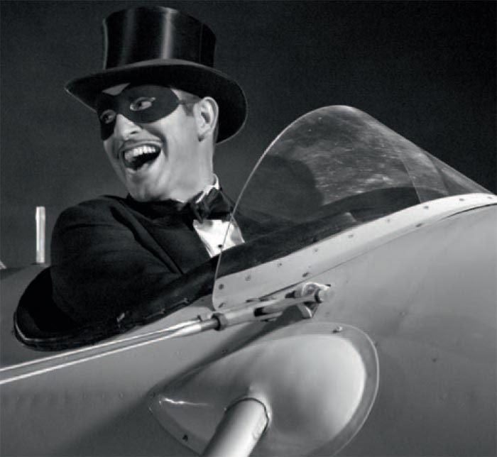
If there is a parallel with the modern film business anywhere in this film—the means of production change, the old stalwarts snub the new technology, the economy crashes, and the old ways become even more irrelevant—then Hazanavicius wisely downplays it, preferring to indulge us in the full-course of movie genres and styles that erupted in that great decade of the 1920’s. He gives us a surrealist dream sequence that rings of Bunuel and Dali, a fast-paced Zorro movie that looks like one of the original Zorro’s from the early 20’s  (or any action movie of the time), and an ornate composition on a large stairway within a studio that looks like something Keaton might have arranged and plays the way Chaplin might have played it. These are just a few of the silent film references. What is strange is that Hazanavicius apparently has no problem alluding to sound cinema, either. Bernard Hermann’s famous Vertigo theme comes up in one crucial scene near the end of the film, causing one to wonder if Hazanavicius is not simply willing to deviate from the form of silent cinema; we wonder if he thinks we are watching a silent film at all.


(The Artist/2011)
(The Artist/2011)
            So the paradox of The Artist stands; in one sense, it is a massive concept movie, in another sense, it’s concept is deceptive; this is not a silent film, and not quite an homage to silent film, either. It is more of an homage to our perceptions of silent film, and an admission that this memory has largely eroded after decades of sound. In this sense, The Artist is a very touching work, but it still leaves one feeling that perhaps it isn’t taking itself seriously enough by the end. The final scene, while clever, is nonetheless a touch predictable and leaves the viewer thinking that perhaps this film was too cynical about its own subject. We got some great nostalgia, but not enough of it.
            There is one great scene that does spawn from that nostalgia. When George and Peppy meet for the second time, on a film set, with the studio boss (John Goodman) calling the shots, a slate comes in to the frame, snaps, and a dancing scene commences. George dances with one woman, then Peppy, then they awkwardly depart. There is an overexposed white out of the frame that cuts over to the next take. The slate returns, and the dance continues, but this time George departs from Peppy and begins dancing with another man before realizing his error. Another white-out, another take. At some point in this sequence, we realize that perhaps this scene is not being shot, per se. Perhaps it is a memory of George’s, or of Peppy’s, or a mash of their collective memories that they are revising again and again, because they didn’t dance together in quite the right way. Their encounter is still imperfect. Their moments of dancing are blissful, but the scene requires that they move on to other partners. The end of the last take leaves a confused and disappointed Peppy standing alone in the crowd of dancers before another white-out, and the last cut. Film was then, and has always been, just a revision of collective memories. It is a way of getting them as close to ideal as you can before the overexposure.
(The Artist/2011)

Saturday, November 19, 2011

Lars Von Gloom


(Melancholia/Zentropa Pictures, 2011)
         
          Twice I almost walked out of Melancholia. Both times were late in the film; the first being when Justine (Kirsten Dunst) plainly speaks to her sister about her disbelief in any other life in the universe, and her acceptance of annihilation; the second being when Claire (Charlotte Gainsbourg) looks through a crude circular instrument made of wire and sees that the planet Melancholia is actually much larger than it was the day before. I did not wish to walk out because I hated this bewitching movie, but because I felt like I was being crushed.
            Despite his reputation for sadism, and for perpetuated cynicism, this crushing sensation was not the fault of filmmaker Lars Von Trier, who has made what is almost certainly his finest film to date. It was the fault of gloom, a feeling that encroaches on too much modern imagery. Melancholia, whether its wobbly camera portrays an awkwardly well-lit wedding or a woman contemplating the Tarkovsky-esque Sea outside her manor, is no exception to all this imagery. What it is an exception to is the remainder of Von Trier’s career; both what came before and will come after. Because although Von Trier is not likely to produce a better film, it is a certain sigh of relief that he finally unearthed depressing visions instead of dictating them. His gloom in Melancholia is crafty and, more so than most contemporary filmmakers, cinematic.
            The opening scene is several special affects short of pure cinema. The strings of Wagner’s 'Tristan and Isolde' glide over dark clumps that must be birds falling from a tinged sky behind Justine’s accepting stare. It then echoes through Justine clutching flowers floating down a riverbed in a bridal gown. A horse collapses in a field sparse with trees at what must be one hundred frames a second. Justine moves through the same field at the same frame rate while globs of tentacled mud stick to her gown. Volts of electricity shoot from her fingertips to the sky. A blue planet moves towards Earth and, in shots that look nearly like sperm fertilizing an egg, hits it with a splash. The strings end. The title comes on screen. The audience shivers from a chill that came from somewhere.
(Melancholia/Zentropa Pictures, 2011)

            This prelude in theory recalls the prelude to Antichrist, Von Trier’s previous film. But in practice Melancholia’s opening minutes are refined bits of film, whereas the prelude of Antichrist was a work of garish exposition and lazy sensationalism. It might be hard to make cinema out of graphic shots of intercourse cut together with babies falling from windows; steadily moving objects closing in on a defined space might make cinema. Maybe Von Trier was at a point when making Antichrist where he did not care about craft so much as zealous expression. He has been at that place in the past, for sure. Or maybe he never could tell the difference between the two; maybe his DP (Manuel Alberto Claro) or Editor (Molly M. Stensgaard) gave him a hand. It does not change the prelude, which is, in practice, a summary of the chronology of Justine’s interior experiences. Holistically, it is a film in its own right.
            The first part of Melancholia shows Justine’s wedding, gone to the pits just as soon as it begins. The Bride (Justine) and Groom (Michael, played by Alexander Skarsgard) arrive two-hours late to the reception. Justine’s sister, Claire (Charlotte Gainsbourg) is furious, while her parents (John Hurt and Charlotte Rampling) do not appear to quite believe in the ceremony at all. We’re not sure if we believe in it either. There is something too strange about this ceremony, stylized in orange like a nervous ritual played out while the sun sets. There is never anything right with Justine, who keeps sneaking off to be miserable in any variety of ways, and to stare at a red star in the distance on the family’s rented golf course. It is not quite a real wedding, with all in attendance aware of its unreal-ness. 
(Breaking the Waves/Zentropa Pictures, 2011)

            This first half is also one big revision of the opening minutes of Breaking the Waves (1996). In that film, a similarly unstable woman married, while her fright-wigged sister (played then by Katrin Cartlidge) did the doom saying. But that scene was choppy and self-consciously grainy. The wedding in Melancholia is choppy without hurrying itself; on the contrary some scenes are slowed to a near molasses pace, even as the camera jumps a handful of frames. It is not self-conscious or grainy; it relies on wild lighting, ambiguously open spaces, and a lot of costumes. Whereas Breaking the Waves feels like a skillfully directed story etched in the coldest possible stone, Melancholia feels like a filmmaker probing here and there, flexing and un-flexing his muscles. Yet, unlike Breaking the Waves, the sequence never feels pompous because it picks a form and does not move from it. The shots of Justine walking out to the golf field, gazing at the star that we will later learn is the planet Melancholia, are the gorgeous earmarks of the ensemble/large space form Von Trier chose. Justine may feel like she is part of that cold stone—and she gets worse in part two—but the wedding sequence feels like a tragic observation. It does not forcibly insert the viewer in to Justine’s head; it places us in that dim field just outside of it.
(The Idiots/Zentropa Pictures,1998)
(Europa/Zentropa Pictures, 1991)

            This more reserved, but still intense, exercise of style is something new for Von Trier, and with it he has at least made one of his visual-angst films the equal of his breezier, looser Danish-language movies. The Idiots (1998), The Boss of it All (2006) and his documentary The Five Obstructions (2004) are on a different world from Melancholia, one that even the director’s fans seemed to have never sufficiently appreciated. At least this time, the visual angst crowd has a point. Not since Europa (1991) has Von Trier been able to exercise style so freely, and with such pleasing results. But Europa, too, exists in a different world than Melancholia. Von Trier’s early efforts are easier to explain, because they belong firmly to the world of movies. Melancholia belongs to some unreachable, interior place. Its overall themes are strikingly obvious, but its overall construction is both awkward and resolute. Its story is a common one, but its images are things that you only see before falling in to a troubled sleep. Melancholia is the most psychological film of the year, and perhaps the most psychiatric ever.
            There is not much point in describing the second part of the film, equally as beautiful, if a little more dragging, than that first half. It concerns Justine’s sister Claire more than Justine, and it concerns the steady encroachment of the vast blue planet Melancholia, which will soon destroy earth. It contains several scenes as beautiful as anything in the first half of the film—snowflakes falling in a garden on a sunny day as Justine stares at a bird flapping overhead, the final scene—but its scene craft is not as important as its conceptual craft. Von Trier has usually structured narratives involving the rest of a community encircling one central protagonist. With Antichrist, he homed in on just two people and apparently forgot about the rest of the crowd, but we saw how that worked out. In Melancholia, he homes in on two individuals and also incorporates the crowd. The victimization complex, so annoying in his earlier films, is still there, but it comes within a more nuanced context; the crowd is not evil, or unlikable, but they do suffer from a form of madness different from Justine’s, and a form of ignorance different from Claire’s. Von Trier has arrived at a conclusion, and set it in to two enthrallingly cinematic situations; a strange gathering in an absurdly vast estate under the stars and a deadly object steadily approaching a familiar object. His sense of orientation is almost perfect this time around, and his sense of tension and rhythm is not dulled by any messages or cynical asides. Part of the reason Von Trier is such a successful foreign filmmaker is actually because he has a sense of pop lost on some other filmmakers; he knows how fun it is to see planets exploding, grand gestures by actors, random violence. By the time the second part ends, we’ve seen him in pop mode. Given the final scenes, we've also seen him in sentimental mode.
Melancholia/Zentropa Pictures, 2011)

            And so I left the theater easily, shrugging off the gloom of the theater and stepping out in to a rain that felt life affirming, rather than some element from an older Von Trier movie. Formality, a relaxation of the things a director should do, a straightforwardness that cuts through genre and experimentation—it all cuts through Von Trier’s inherent gloom. Melancholia might be this year’s most relevant movie, but not because we’re all gloomy these days, like Von Trier. It is relevant because it lets you leave a darkened space, full of unreal images, and stride through the rain, just accepting that it’s raining, finally.
 

Sunday, November 6, 2011

Double Motion Study: Blood and Trash


(Antonio Banderas in The Skin I Live in/2011)
           
          A gloved hand sticks a hypodermic needle in to a plastic bag full of blood and slowly withdraws a sample. It is the hand of a mad doctor who specializes in reconstructive skin surgery. On the following shot of his studied, dark Spanish face, a naked, out of focus body is visible on an operating table just behind him. The doctor ejects a droplet of blood on to a microscope slide and there is a cut. Bees buzz around a bees’ nest. A faint zoom from what looks like some kind of gothic fish tank, outlined in red, blue swirling through the middle. It must all be blood cells. Dr. Ledgard’s hand places a glass slide over the slide with the drop of blood. The blood expands just enough to not drip off the sides. Strangely, it turns a less wicked, orange-red. The doctor’s hand tamed it. A hand that can tame blood can only belong to a dangerous person, such as Dr. Ledgard in Pedro Almodovar’s wonderful freak-out on film, The Skin I live in (2011).
            On unfocused film, in a hut on a tropical island, another doctor, this one a biologist, finds himself alone with a needle. This means some sort of experiment. He injects the needle in to his tanned arm. He removes it and drops the blood very slowly on to a set-up we can’t quite see, on a makeshift table. The low-angle shot brings his face out of focus. The blood droplets pool. He brings a microscope up to them and examines his own blood. Suddenly he seems, unlike anybody else in the surrounding film that is Lucio Fulci’s very trashy Zombie (1975), exalted. 


(Zombie/1979)

            Why did film choose blood as its fixation? Is it because it’s red, or is it because it comes from our bodies? It is not a mystery that in this most perverse art form, the only one that rewards perversity, it is the most universal, most life signifying of all bodily fluids that has completed the most concrete imagery, and elevated the highest number of trashy films. The mystery is what blood itself signifies. It cannot be called a metaphor for life/lust/envy/death, because it is also a metaphor for emotional extremes/illness/solitude/obsessive behavior. It is not possible to pin down (well, that’s because it’s liquid). Yet of the two mentioned films, only Zombie needs such a loaded image to elevate it; Almodovar’s The Skin I Live in is an outstanding achievement; a film that has been shrugged off due to its deliberate exhibitionism and the tiresome productivity of its director, it is in fact one of the few cathartically weird delights in recent cinema. Zombie is a cult film from the late 70’s made by a professional trash director of the Italian horror school. Yet both use blood in their most obtuse moments, and in one or more of their moments of pure cinema.
 Almodovar and Fulci both chose it because it is an easy fixation. More so, they managed to create a mirror; the obsessed skin surgeon and the exalted biologist are the plain representations of the film viewer, or the filmmaker; the one’s so fascinated by trash, they will take it upon themselves to make sure they watch it, jeer it, gasp at it, stare at it, inflict it on themselves to the end of cinema until they at last have understood the mystery of that central ingredient: blood.
 

Tuesday, October 25, 2011

Unsound Logic: Martha Marcy May Marlene


(Martha Marcy May Marlene/2011)
           
             A woman walks away from a peaceful farmhouse. Wood is chopped there. Soup is eaten in silence around a wooden table. No breeze affects the foliage. She looks behind her and crosses the lightly paved road. She runs in to a path in the woods. A man calls out to her; “Marcy! Marcy May!” He pursues her in to the woods.
            She hides under a tree on a slight overhang. Two people run past her.
            She makes it in to a small town. She sits at a diner eating. A light haired man comes in. He sits and asks her what she thinks she’s doing. Says everybody else is worried about her. Marcy May says she wanted to go in to town. The man asks he why alone. She doesn’t have an answer. He eats some of her food, without quite getting her permission. He leaves her there.
            Outside, Marcy May picks up a pay phone.
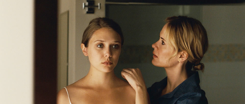
            If you have not seen Martha Marcy May Marlene, then this scene may sound perfectly mysterious, and it may view that way also. To spoil it just a bit; Marcy May’s real name is Martha (Elizabeth Olsen), and she has been living with a rural cult headed by her “boyfriend” Patrick for two years. The person she calls on the pay phone is her older sister Lucy (Sarah Paulson), who has not seen her in at least as long. Lucy picks her up and takes her back to the Connecticut lake house of her and her husband Ted (Hugh Dancy). We learn that their Mother died and their Father was unreliable. We learn that Martha has a history of trouble, and may have suffered from mental instability before she joined the cult. As for the present, Connecticut isn’t helping. Martha can’t control herself. She thinks she’s still in the woods, a happy servant to a man who is, essentially, a pagan and a narcissist. And more.
            But if you don’t know any of that already, then you can watch that opening scene up to the point when Martha, with the look of a young girl who has been spanked, picks up the phone. There is already a certain unsound logic to the film. Why didn’t the runners in the woods see her, when she was barely hidden? Why did the young man, Watts (Brady Corbett), not forcibly take her back to the cult? Given what knowledge we gain of the cult, this is exactly what one of the men would have done.
(Martha Marcy May Marlene/2011)

            Or skip a few scenes. Many scenes. What kind of sister takes her younger sister, traumatized, wearing filthy clothes, missing for two years, home and never to a hospital for various tests, then to a psychiatrist as a preventative measure at the least? How lucid is Martha? One scene, she’s swimming naked. Another she’s sleeping on the kitchen floor and wetting her dress. In others, she’s criticizing her sister’s past shortcomings, critiquing capitalism, talking about memories before the cult. Is this woman a victimized outsider of the Dreyer--Von Trier line, or a mentally ill woman trapped in a situation even more disorienting to the viewer?
            Now here is writer-director Sean Durkin’s conflict: he seems to know all the answers, but he has designed his film to deny each one. First he sets his film up as a fractured memory narrative, and then he resets it as a psychiatric mystery. Then he resets it again as a sentimental narrative about the broad meaning of family, and then he decides on a bourgeois expose, before settling in the final scenes on a paranoid chase movie. Durkin has made the mistake of a movie in which the central character embodies so many concepts, so many screenwriting-class character motivations and secrets that it becomes impossible for Ms. Olsen to truly deliver. Which she doesn’t. This isn’t to say she’s incompetent; at least her character holds our sympathy most of the time. But she is surrounded by nincompoops; her sister, her sister’s husband, and her cult, all of whom are sketched as ambiguously troubled people who dance around her larger troubles. If the protagonist is mad, and there is nobody in the “sane” world who acts practical or the “mad” world who acts enthrallingly nuts, then what are we left with?
            Answer: John Hawkes. As Patrick, the charismatic, pathological leader of the cult, Hawkes is surely the strongest thread in the film, and his performance takes on an eerie presence that affects even the mechanics of the film. Cinematographer Jody Lee Lipes calms down when he’s in the frame; the camera shows him sitting on a wooden chair with a dinky acoustic guitar, playing a song called ‘Marcy’s Song’ while the commune watches him from the shade of a barn. The sound gets streamlined as he shows the girls how to use a gun and kill cats, the lighting decisive and shadowy as he sits on the steps watching an orgy. John Hawkes may be on his way to creating a film persona; a slightly rabid, but not inarticulate guy who looks quite comfortable in his woodsy psychosis. It was the same type of persona he played in the fantastic Winter’s Bone, and it’s got surprising flexibility.
(Martha Marcy May Marlene/2011)

            But the film has too much flexibility. And this is the problem with many recent films to come out of Sundance with a blaze of hype behind them. They are hyped for their concepts rather than their craft. They are cleanly shot ideas with no internal logic, and so much polished narrative material that is too much for the average twenty-something actor/actress getting their big break. By the time we get to the end of Martha Marcy May Marlene, we’ve seen at least several conclusions, and the undeniable truth, suggested by the title, that Martha’s identity is scrambled. She must choose Martha Marcy May or Marlene; the film chooses all of them at once, calls them all legitimate, and goes stark raving mad.

Sunday, October 16, 2011

Guest Post: Take Shelter (by Tyler Rubenfeld)


https://blogger.googleusercontent.com/img/b/R29vZ2xl/AVvXsEgn6SJM-QxEZLAWFZRhCShjZeh8KtKGrHYrMF0Zj1AE4WFDQaZ6fS_YTjlVauAEh_GPyletXtSZFXysT6_-nPZmOPP2_N6M8yhyphenhyphen-K1SGmM3OZj_iRpIURg21nqXh1pHrqAiRXx5FF-2LhEE/s1600/Take+Shelter+Movie.jpg
(Take Shelter/Sony Pictures Classics, 2011)
Like Gena Rowlands, Klaus Kinski and, yes, even Nicolas Cage, Michael Shannon can carry an entire film simply by being unhinged. With wide-set eyes and a tight mouth that doesn’t so much speak as it secretes words, Shannon is one of the most magnetic character actors working today. It’s no surprise that he’s played crazy enough to pick up a Best Supporting Actor nomination along the way, for Sam Mendes’ “Revolutionary Road.” It’s also no surprise that he’s been cast as the villain in Zack Snyder’s God-forsaken “Superman” reboot. These scenery-chewing parts are tailor-made for queer ducks like Shannon, and though they seem like easy paychecks, who can argue? Give him a complex and he’ll entertain.  
Unlike Nicolas Cage, however, Shannon is equally bewitching in “normal” parts. Call it the Ryan Gosling effect: his blank expression could be read hundreds of different ways. Even as the sanest one on screen, he’s imbued with the greatest mystique. This was achieved best in Jeff Nichols’ debut film “Shotgun Stories,” a startling piece of Southern Goth centered on the escalating feud between two sets of half brothers. Shannon’s taciturn Son Hayes, the eldest brother, snaps between responsible father and vengeance-fueled barbarian. Yet both facets are always present—he’s both an upstanding citizen caught in a violent uproar and a domesticated beast sipping beer on the porch. It’s one of the more believable portraits of revenge committed to film in recent memory. Nichols takes full advantage of Shannon’s ever adaptable poker-face, and though it would be a giddy thrill to watch him explode in a fit of Crispin Glover-style batshit insanity, he keeps the crazy at bay. It’s always there, simmering, but for “Shotgun Stories,” that’s enough.
Nichols’ sophomore effort, “Take Shelter,” amps up the energy. Shannon plays Curtis LaForche, an Ohio family man and chief crewmember at a local drilling company. Like Son Hayes, Curtis’ biggest concern is providing for his family. His wife Samantha, played by Jessica Chastain, takes care of their deaf daughter and sells her embroidery at a flea market. With this system, they’ve more or less reached financial stability.  They can afford their daughter’s cochlear implant and can start planning for a bigger house. 
(Take Shelter/Sony Pictures Classics, 2011)

As the film opens, Curtis stands in his yard observing a menacing set of storm clouds. It begins to rain a thick, amber liquid reminiscent of motor oil. These visions occur night after night, become increasingly frightening, with rabid groups of people and Curtis always scrambling to protect his daughter. He later explains that the weather is making people crazy; it’s a credit to Shannon’s performance that it took me days to realize that this is also the plot of “The Happening.”
Structured like a hurricane, “Take Shelter” eventually subsides on the night-after-night dream sequences, and the film enters an eerie calm. Though this portion contains some of the most chilling set pieces, it’s restrained, and it’s hard to scale back on the explicit horror without losing some steam. Audiences looking for more of the nightmares’ mainstream thrills (or more similarities to the canon of M. Night Shyamalan) may start to lose patience. Nichols has already established a base level of foreboding, and it’s here, in the stillness, Curtis stops his car on the side of the road—his wife and daughter asleep in the back—to observe soundless lightning, splayed in all directions. He says aloud, “Am I the only one seeing this?” It’s a real question: Curtis has a history of schizophrenia in his family, his mother developing it around his age.
Whether it’s impending doom or impending mania, it’s impending, and Curtis won’t rest until his family is safe. He breaks the bank on canned food and gas masks and a tornado shelter. The LaForche family budget flies off the handle as much as its patriarch, and it’s a cringe-worthy thing to witness. Though a common practice in Fassbinder films, it’s odd that, in today’s economy, few films use the act of overspending to heighten suspense. Monetary woes are always front and center, giving “Take Shelter” much more recession-era immediacy than the tacked-on relevance of “Up in the Air” or “The Company Men.” Curtis’ visions echo the country’s fears of climate change and terrorist attacks—violent upheavals that no man, no matter how good of a protector or provider he is to his family, can face. The cost of braving the storm is staggering. 
(Take Shelter/Sony Pictures Classics, 2011)

Curtis becomes such a tight-lipped, quivering mess that, when he does begin to explode, it’s downright terrifying. He literally becomes the proverbial soothsayer snarling about the apocalyptic flood that will wash everyone away. This is the batshit Michael Shannon that we’ve come to love and fear, and his transformation is a sight to behold. He’s matched by the justifiably ubiquitous Jessica Chastain, who breathes life into the normally underwritten role of “the scared, patient wife.” Her options dwindle by the minute until she has no choice but to weather her husband’s storm.  Unfortunately, “Take Shelter” ends a few scenes after it should, and it’s hard to think of its frustrating ambiguity without thinking of the doggedly debated denouement of “Inception.” Though by no means a letdown, the ending merely hints at a less intriguing interpretation of the events.  Oh well. Narrative clumsiness aside, “Take Shelter” is one hell of a rush. Whether it’s the end of the world, the fall of the American empire, or the descent into madness, catastrophe will come with a hefty price tag. And that’s the scariest thing of all.
 Tyler Rubenfeld is a New York-based writer and filmmaker. He's on Facebook, and he tumbles: http://burnthemonfire.tumblr.com/

Wednesday, October 12, 2011

The Worst Theater in New York


          Of the outer-boroughs, the neighborhood I have always found the most straightforward and relaxing is Sunnyside, Queens. Straightforward because it makes no pretensions about being an outlet to a highway—where Queens Boulevard and Northern Boulevard join with route 495—but it takes advantage of this commerce, making it a sort of compressed streak of the kind of ethnic food and small business-meets-large retail stores you might find in the rest of Queens, all lined up on either side of the train tracks. Relaxing because of all the space, trees, homey brick buildings and relative quiet. I have never felt unsafe there; I have even walked home through the neighborhood late at night, and it seemed to honestly say; ‘Yup, I look pretty shady now, don’t I? But don’t worry. We cool.’
            Yet Sunnyside is also home to the Sunnyside Center Cinemas, a seldom-visited movie theater with a fairly incredible reputation. Incredible here means horrible. It has an average three-star rating from a mere thirty-six reviews. Reviews read: “Between the overpriced multiplexes and places like this…no wonder people wait for the DVD releases;” “Worst movie theater I’ve ever been to. I don’t care that the tickets are $7.50. This place is a f-ing dump;” “What more could you ask for even if you’re kind of desperate…and maybe a little drunk;” “Gross.” Indeed, elsewhere one can read or hear backup evidence that this might be the worst theater in New York City. On the appealing side of things is the fact that tickets go for an astonishing five dollars for matinees. On the sentimental side is the fact that, apparently, this theater is a neighborhood landmark. On the side of abstract-appeal is the notion, as one reviewer kindly put it, that the theater “…should suit the tastes of those who like things slightly on the fringes.” As someone who occasionally enjoys things on the fringes, who writes, and who was recently fired from his job at a different, somewhat fancier movie theater, I realized that I would inevitably have to see a movie there. So one breezy October Sunday, I did.
            I arrived at the box office just before 2:30, to see the 3:00 show of Dream House. I asked the gentleman at the box office if it was true that tickets were five dollars on Sundays. He said yes, for matinees. He was actually very amiable and well-dressed; I considered that maybe people were giving this place an unfair rap. But then, there were the handwritten signs taped to random posters announcing midnight screenings of The Ides of March and one other movie, because somebody was too lazy to put them on the marquee. There was the inside of the theater, which resembled the inside of an asylum that the inmates did not just take over, but got tired of long ago. There was the fact that I saw nobody else entering or leaving the theater, causing me to wonder exactly how the place survived. But no matter. I walked around for a little while, ate a doughnut, sent a friend a text message about writing for Collectors.
            I should now clear up some preliminaries about the theater. First off, the Sunnyside Center Cinemas shows only bad movies. The films playing when I arrived were Abduction, Dolphin Tale 3D, Dream House, What’s your Number?, and Killer Elite. The sort of gleeful, obtuse trash glorified by Quentin Tarantino in all his redundancy? No, but also not the type of material that anybody reading this years from now will have heard of. Secondly, the theater has no website. Either it is too good for any real presence on the internet, or too terrible, but who draws such a line. Third, it is listed on Fandango as “good for kids.” Hmm.

            When I returned to the theater ten minutes later, I first noticed two signs on the doors. One said that all bags were subject to searching, and the other read “All Exits final. No re-entry.” This second sign I found particularly weird. What if I bought a ticket, but had to run outside to make a call, smoke a cigarette or meet a friend? You still won’t let us re-enter, even with stubs? Or is it even more drastic? Does this sign really mean that once you’ve been the to Sunnyside Center Cinemas, you can’t come back? If that were the meaning, it contains a sort of cardboard poetry which I may approve of. In any case, I don’t think these people thought through, or enforce, their sign’s warnings.
            Opening the door, I encountered an overweight girl throwing something in to a trashcan in the lobby. Nice introduction. I asked her if I could go in. She looked at my ticket and asked me what time it was (she asked me what time it was!). I was forced to take out my cell phone and tell her, after which she told me to come back in ten minutes and the theater would be ready. I walked back through the lobby, the stickiness of the floor threatening to suck off my shoes any second. For those ten minutes, I mainly lurked around outside the theater, acting like somebody who might see movies there regularly. I watched a few more people arrive and buy tickets from the nice ticket guy. A few people left the theater. I noticed while I observed them that the clientele seemed decent. By decent, I mean regular people. Not the type of “regular people” who tend to live elsewhere in the country and whom most New Yorkers are terrified of meeting. Regular people who represented all ages, who all seemed part of the lower and middle-middle classes, who looked like they had jobs and families to go to, who looked educated to at least some extent, just not devout New York Times readers. Regular people. All in all I counted forty of them, including both comers, goers and myself.
            It was now 2:58 and people were exiting the theaters from all directions. Also in all directions was a tiny hallway with the most menacing carpeting I have ever seen. A guy in a pink shirt, who looked like he wanted to be John Travolta in Grease, except Hispanic, took our tickets and told most of us to go to theater one, where Dream House was showing. I walked in and sat down. This auditorium was bigger than the smallest auditorium at the theater where I had previously worked, but smaller than just about every other auditorium in the city. I sat down in a seat: a plus! The seats were comfortable. Although the lights were off, sparing us the potential trash-heap we were sitting in, I didn’t even mind slouching down in the chair and putting my feet up: perhaps because of living in my wretched apartment for the past eight months, topped off with a bedbug infestation, I have a higher tolerance for generally unsanitary places. I counted sixteen people including myself who walked in to the movie theater. Not terrible for a Sunday afternoon, but I doubt the numbers ever got much greater. A rickety old guy who didn’t quite know where he was sat behind me.
(Dream House/Universal Pictures, 2011)
            The trailers started. Jack Black and Steve Martin making wisecracks in the woods; Leonardo DiCaprio squinting, failing to be more than an adolescent drama student; that Ben Stiller heist comedy where he robs some Bernie Madoff-symbol. But oh my God. This projectionist apparently found it sufficient to play each trailer to the point of; ‘Ben Stiller in—‘ Cut. Next trailer. ‘Jack Black—Steve Martin.’ Done, you get it. Next. Then a trailer for The Girl with the Dragon Tattoo. Jesus Christ, did this theater go out of its way to show even the most insipid trailers? This was the not the industrial-rock music video trailer that everybody thinks is cool; this was some drawn out summary of the movie that, naturally ended with ‘Daniel Craig in-‘
            Daniel Craig was also in Dream House, which came on after a few minutes. And how was the movie? Well I’m sorry, but I already gave it away a few paragraphs ago. So I’ll put it a different way; it was a piece of shit. The first thing I noticed in the movie was; that is some fake snow. Daniel Craig played a man leaving his firm in Manhattan for the countryside of Connecticut amid a snowstorm that looked like a snow globe with lights left on by an disgruntled gaffer blaring in to the scene. Then we met Craig’s young daughters and his wife, played by Rachel Weisz, who strangely (appropriately, as I soon saw) acts more like an imitation of a person than the real thing. They go to their new house in Fairfield, but soon realize that the previous owner had gone insane and killed his family in that very house, five years before. They also realize that their neighbor (Martin Csokas) is a total grouch and that his pretty wife (Naomi Watts) holds some mysterious secret. Here’s the thing: the twist in this movie, not that hard to guess, comes about halfway through, after which the movie morphs in to a whodunit, then a sappy love story, then, in the last few minutes, an action movie with ghosts. Before the twist, the story is implausible: why didn’t the real-estate agent tell them about the murders? Didn’t they even tour the house beforehand, sparing them the discovery of those spooky symbols? Why does Daniel Craig staunchly refuse to put on anything but his James Bond accent? After the twist, it becomes utterly ridiculous. Dream House seemed to me a film that took the idea of artistic roots to mean formulas that Steven King invented but has now grown tired of himself. Its visual rhythm looked to be based on how drastically the makeup on Daniel Craig’s face could be altered. My favorite moment came at the point when the rickety old man behind me exclaimed, “She can’t even act!” I took the film, about a couple moving in to a creepy house, as a thin metaphor for me entering the Sunnyside Center Cinema. Hell, for me entering New York.
            As I left the theater, I thought about checking out the bathrooms, just for good measure, but quickly vetoed the decision. I walked outside, remembering, of course, that there was “no re-entry.”
            I stopped at the box office and asked the polite guy if there were other Center Cinemas in New York. He said yes, on Main Street in Flushing. I asked him how long the theater had been around. He shrugged and said a long time, he thinks the 70’s. I thanked him and left.
 

            The 70’s: a time when theaters like the Sunnyside Center Cinemas were a slew in New York, though mainly in Times Square instead of the outer boroughs. A time when bad movies like Dream House were trashier, less dressed-up, more symbols of nostalgia than dull narratives. The 2010’s: A time when every bad movie can be seen anywhere, when even the worst movies are ironically “good,” and when cinema feels too certain of its future, while I remain uncertain of my own. Perhaps I was a little disappointed in the theater; angry that it had not been much shittier. Perhaps I’m too picky about what the shittiness of today must look like, cinematically or otherwise. I turned on to 48th street, saw the sky getting cloudier, and walked on home.

Saturday, October 1, 2011

Motion Studies: Clowns


            http://cdn.pigeonsandplanes.com/wp-content/uploads/2011/09/juggalos.jpg
           As the montage that opens Sean Dunne’s American Juggalo moves along, it becomes more tempting to see not largely clown faces, but only clown faces.
            But of course, American Juggalo is about many faces. So we watch, in not-too-slow-motion: a man in face paint pouring soda over his head in the back of a pickup truck stuffed with fans of the Insane Clown Posse; two boys in ICP t-shirts and white face paint staring at the camera with a gang-like blankness; a man in a black shirt and red baseball cap dancing on a picnic table for his friends a grouping of shirtless youths on a makeshift raft, trying to stand on the raft and happily falling, because that was the whole point.
            About half of these people wear makeup, about half do not. Some are shirtless, some are clothed in the style of teenage suburban Americans who can only afford so much, but make style from what they do have on their bodies. Some are intense, unapproachable, un-emotive, perhaps out of a genuine resentment for anything societal, perhaps from drugs and alcohol; these people stay stoic in the camera's frame. Some are emotive, approachable, articulate, and apparently carefree; these people move around generously in the camera's frame. At about the time the music changes from a drone to a dance beat—at the point when we watch the man dance on the picnic table—our conclusion is not that this is the stoicism, articulation, and mobility of young Americans. Not of clowns.
            But these young Americans must understand how that clown face-paint looks colorful, zesty, enticing against the sunny countryside of Cave-in-Rock, Illinois during the annual Gathering of the Juggalos.
 http://vimeo.com/29589320

Thursday, September 29, 2011

Film Appreciation: Gesualdo: Death for Five Voices


(Gesualdo: Death for Five Voices/ZDF 1995)
       
        Hardly anybody would call Gesualdo: Death for Five Voices (1995) one of Werner Herzog’s best films, but it is for this reason that we should try to examine it from each side, like Herzog tries to examine the engraved stone that turned the composer Carlo Gesualdo (1566-1613), already a madman, in to an insomniac.  The film was made during Herzog’s gray period, a period which began immediately after Klaus Kinski failed to pull the boat ashore at the end of Cobra Verde (1987) and ended upon his move to America in the mid-90’s. Death for Five Voices may have been the end of this period in Herzog’s career and what it most emphatically expresses—sometimes deliberately, sometimes unintentionally—is the feeling of being washed up. Of nomadically scrambling around a continent, not knowing what nation you belong in. Of being driven past insanity after murdering your wife and her lover. Of loving music deeply, but having not a clue as to what it means about life and death. Of not knowing what to make of the complex madrigals and wild harmonies of a man who lived prior to every successive great of classical music. Of loving narratives and loving documents, but no longer being certain about how they collide.
            Saying Herzog identified with Carlo Gesualdo is too much of a conjecture. That said, Gesualdo does fit squarely in to the same picture that Don Lope de Aguirre, Walter Steiner, Kaspar Hauser, et. al had all joined. He was certainly an eccentric, certainly rejected any expectation society foisted on him (the expectations of a prince), someone who gradually distanced himself from all the other characters in his story until he became a solitary block of creativity, unseen and unheard except in music. The main difference between Gesualdo and any of Herzog’s other subjects is that he is long dead at the time of the film, and so are all the other players. This creates opportunities, seized often enough, to structure the film as an investigation of insanity in hindsight. Shots of decaying castle rooms, music eerily ringing out from somewhere, are sequestered with interviews with historians, conductors, musicians, and a few busybodies just hanging around the castle, on the circumstances surrounding Gesualdo’s murder of his wife and her lover. He was born of royalty, grew up composing furiously and with discipline. His wife began an affair without his knowledge, ending in her husband’s discovery and rage. Gesualdo descended in to a paranoia regarding his biological relation to his young son and killed him by swinging him to death, while a chorus sang. These descriptions are accompanied by choral music, and yet more disturbingly, cut to scenes inside a (invented?) mental home for children where one is strapped to a horse and rides it in circles, while fake-soothing words are spoken to him. The ghost of Gesualdo’s wife appears, running down the castle stairs with a tape player, pursued by the camera. Scenes such as these are odd and creepy not just for their juxtaposition, but because it feels that Herzog may be becoming the madman himself, finally. This has always been the real reason to see his best documentaries. 
(Gesualdo: Death for Five Voices/ ZDF 1995)

Then, why—especially for a filmmaker who purportedly hates “mere facts”—do these scenes give way to an overbearing choral director from Michigan, an English historian who sits in the same place for too long, and various items and points of interest that are shown, then dropped? One gets the feeling that, contrary to his love of fabrication, Herzog was trying to cram in all the facts he could get his subjects to utter. And when there are no words, one gets the feeling that Herzog is simply interested in too much in this castle where Gesualdo lived to assemble in to the narrative. Statues, stones, dusty rooms interest this filmmaker; they would interest us more if they were placed in a different film.
True, we must consider that Herzog shot this film for television. Its running time is only one hour, and with all its unevenness, we want it to be longer. The Italian locations are beautiful, but even they hurry past. Herzog knew he wanted to get somewhere at this point in his career, but at the time of Gesualdo: Death for Five Voices, he was still pursuing that horizon. Some of the collaborators on the film, such as the cinematographer, Peter Zeitlinger, have stuck it out as Herzog’s late-period side men. But at this time, Herzog was able to turn out a long-winded, intermittently fascinating documentary that feels throughout like it expects to be underappreciated. Just like Carlo Gesualdo. Just like that mysterious stone that gave him insomnia. That may be another fabrication.
(Portrait of Carlo Gesualdo)